UPDATE 7 June 2012: The new EPG is starting to roll out slowly in the UK and we've already got it. Sky has told Pocket-lint that the roll out will be phased out gradually to a wider audience in the coming months.
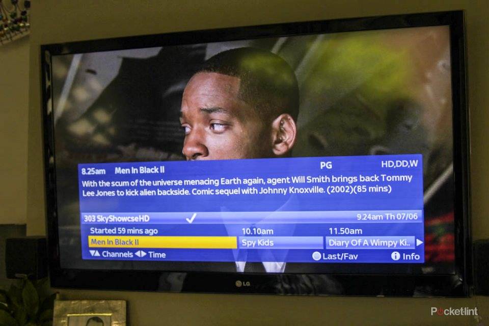
A second glance on our home setup and it is clear that the new EPG is considerably crisper with the new tighter font working well on our 46-inch LG Cinema TV.
Now having eight channel listings on a single page in the TV Guide menu also means you can see Sky Living HD and Sky Atlantic HD on the first page when you press the TV Guide button. That should make a big difference in content discovery for those channels.
For those that like to record and store lots, the Planner split by genre also is likely to make a big difference.
***
ORIGINALLY ARTICLE: Sky is set to roll-out a new and improved electronic programme guide (EPG) to customers from the end of May and Pocket-lint has already had a walkthrough of the new interface.
Shown to us behind close doors, the bad news is that we weren't able to take any photos of the new interface as Sky informed us that many of the final details of how it will look and work are still being put through their final testing stages.
No pictures then from us, but we are allowed to use our best descriptive skills to explain what you can expect when it lands on your Sky box in the near future, and beta testers of the new EPG have already started to upload videos of the new interface for us to show you. The joys of the internet, hey.
A new look
The biggest and most notable change is a complete overhaul of the font and and graphics side of things.
While naysayers to the current EPG will still be disappointed that the overall design ethos hasn't changed, the interface has been refined.
There is now shading. The red, green, yellow, and blue buttons at the bottom of the screen to remind you about Anytime or the planner have horizon reflections akin to an iOS logo, while the orange highlighting has been replaced with a more subtle yellow. The cursor highlight is now a gradient yellow too.
It looks smart and very iPad.
The new tighter font looks crisper, the whole experience more refreshed. And if you've been using the Sky Remote app, you can see where the designers have got their influence.
That tighter, crisper font means that Sky can now fit more information on the screen without it looking cluttered.
You now get eight channel listings running vertically top to bottom rather than the previous six, and there are eight sub genres, or categories, instead of six, left to right across the top too.
But it's not just a new lick of paint that the EPG has received. Sky has added a new feature it is calling "Genre hubs" as well.
Genre hubs
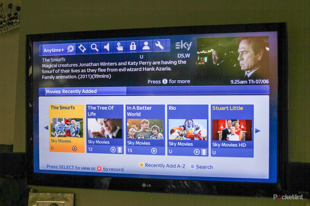
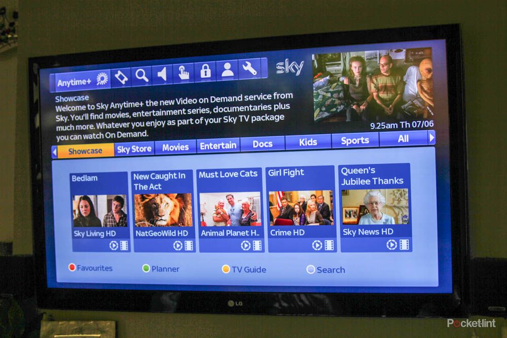
In the new interface when you scroll left or right in the listings, instead of simply going to a long list of movies or sports channels you are presented with five large boxes prompting you do opt for something more specific before selecting what to watch.

In the case of Movies that is whether you want to see what's on now, what you've got recorded on your planner (the planner now lets you see recorded content via genre as well), what's on demand, what's available for rental, and search.
Whingers - and we are sure there will be many - will complain that there is yet another button press to endure before getting your content, but it's clear from seeing it in action that Sky is really trying to leverage all the different ways to access the plethora of content it now offers.
Now you can quickly see what movies, for example, are available to you, rather than having to remember to see what you have recorded or remember what is in Anytime+ or the Sky Store.
Genre hubs in Planner
In the Planner users now get to view there recordings via type rather than just a long list. Acknowledging that many, especially those with the 1TB box, record lots of shows and movies to watch whenever, aside from an A to Z list, you can now see what movies you have, what documentaries, what kids shows. That's going to be great if you want to pinpoint one specific genre of content and we really like the idea.
There are granular changes too. The info bar when you are watching television is now slightly transparent, and a new Sky+ play/pause/fastforward/rewind logo set with shading, gradient, and a bit more animation.
So there you have it. No pictures sadly, but hopefully a good idea of what you can expect of the new EPG when it rolls out shortly.
As soon as we get images of the new EPG in action, we will make sure we share them with you.
Images credit: www.pear-digital.com