Dark mode, until recently, has been the reserve of developers and professional creatives such as photographers and movie makers.
But in 2019 that changed. A number of companies from Apple to Google to Facebook all embraced the idea that not everything should be white all the time and started offering users the ability to choose an alternative colour palette that was easier on the eyes late at night.
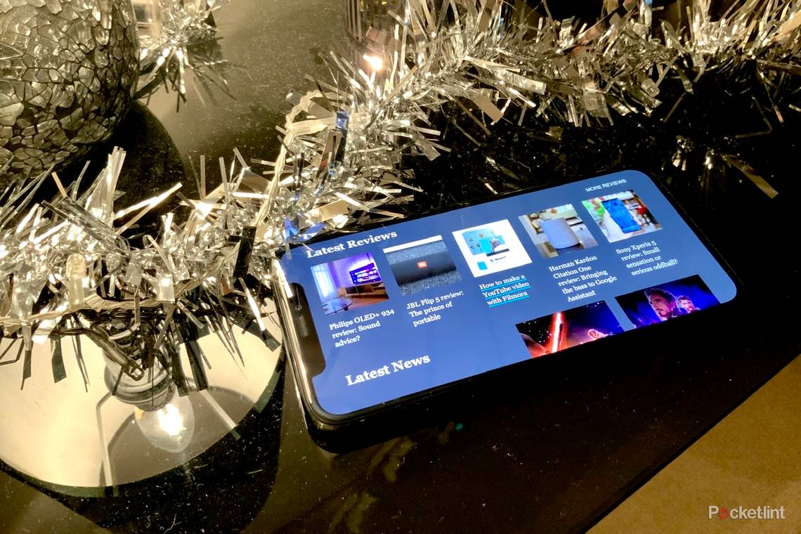
We're pleased to say that you can now add Pocket-lint to the list of companies offering a dark mode option when browsing the website, and from today you can read your favourite news, reviews, features, buying guides and more in either light mode or dark mode on our site.
But why have we chosen to add dark mode to Pocket-lint, what are the benefits, and how can you enjoy it yourself?
Why go dark?
There are a number of advantages in using dark mode ranging from being easier on the eyes - especially late at night, making images stand out more, improving battery life, and most importantly improving accessibility.
Google says that it found that one of the biggest advantages of dark mode after implementing it on the latest version of Android (10) is that it can lead to improved battery life.
Apple doesn't cite battery performance gains but has told Pocket-lint previously that its reason for embracing dark mode is due to numerous creative professionals that requesting the company embrace the experience to remove any distractions.

For Pocket-lint, the decision to go "dark" was a combination of all those reasons, but also because of a request by the team that it's something they wanted and were sure our readers wanted too.
Working in a range of environments from an office during the day or a plane flying across the Atlantic, to an event in a far flung venue somewhere around the world, it's understandable. Team Pocket-lint spend a very large amount of time not only staring at a screen on a phone, tablet or computer, but also on Pocket-lint.
Dark mode was requested and the challenge to implement it began.
How it works
We'll cover the design process in a moment, but it's worth noting how it works and how you can turn on dark mode.
What was clear from the start was that dark mode isn't something that's suitable for all environments and all applications. It's therefore not something that should be automatically forced on visitors regardless of whether they want it or not. And so that's the approach we've taken at Pocket-lint. You can completely ignore Pocket-lint's dark mode if you like and continue using the light mode as normal. That was important.
Dark mode, and the now corresponding light mode, should be a user preference to enjoying the content and not something you have no choice about.
Some love the idea of dark backgrounds, light text and everything that comes with dark mode, while others find it too polarising and too jarring compared to the way they are used to seeing websites.
With that in mind we offer dark mode in three distinct ways:
- Determined via the device's operating system
- Activated via a toggle switch at the top of the site in the masthead
- Controlled via time of day
The first makes logical sense. If you are running dark mode system-wide because you've opted in via the system preferences of the device you are using, the chance is that you would want to see Pocket-lint in dark mode.
The second is designed to allow you to turn dark mode off if you don't like it, but also to enable it if you're not running dark mode at a system level.
The third, we think, is trying to understand the needs of the user without them having to worry about it themselves. Dark mode is best enjoyed when it's dark outside - i.e., at night - and so we've opted to automatically turn it on from 10pm to 7am even if your system settings are set to light mode. We're able to do this by understanding what time zone the user is on and setting it accordingly. Of course, you can override the setting should you wish via that all-important toggle switch.
Designing for dark mode
Dark mode isn't just about inverting the colours from black to white and white to black.
At Pocket-lint we looked at a number of dark mode palettes to analyse what's best from not only an accessibility point of view, but also from a readability point of view.
Documentation on the web is still very much in its infancy and while some palettes are good in some environments they don't work in others.
Go "full black" and long articles with lots of words become tiring to read, while picking too light a grey means the dark mode effects are lost. You also have to account for font and font colours, font spacing in terms of kerning and leading, as well as elements like hyperlinks, captions, image credits and other "font furniture" around the page.

The end result was to pick a colour palette with a strong blue-grey and turquoise influence delivering, we believe, a dark mode that is approachable on a number of levels as well as passing a number of accessibility tests for usability and readability.
To get started we used colorhunt.co. The simple-to-use website allows you to see various colour palettes and how the colours complement each other. It is a fantastic resource regardless of your dark mode designing needs.
Once we'd picked a palette that we wanted to work with we set about translating those colours to Pocket-lint's design.
We used the darkest colour within the palette as our default background with the second darkest as a highlighter to that background.
You'll see these colours most prominently on our newly designed hub pages. The use of colour here lifts our "card" design from the page and improves readability considerably. We also used the colour for the horizontal rules around the site to break up lists on the homepage for example.
The gut reaction would be to use the turquoise colour in the palette for hyperlinks, on a light background that works well, however this is one of the common mistakes when it comes to dark mode. Coloured text on a dark background doesn't work.

To combat this, we've changed Pocket-lint hyperlink style to a thick underline that highlights on hover rather than colouring the linked word or phrase. Taking this approach makes it much easier on the eye, and we've even adopted it in our light mode theme too going forward.
To improve readability, we've opted to colour the text on the page an off white / light grey, the final colour in our chosen palette, rather than opt for "full white". This creates a much softer experience, and one that we believe is much easier on the eye when it comes to reading.
Yes, dark mode is about contrasts, but you don't want it too contrasting. Black and white really can be very harsh side by side.
Once we had finalised dark mode, we turned to updating our now new light mode. Previously the only mode, to keep a consistent design style and ethos it too had to change to match the same approach and beliefs.
For Pocket-lint that means a new hyperlink style and a new font colour - the darkest colour in our new palette, as well as a few tweaks and changes elsewhere to keep things consistent.
Accessibility
While many merely see dark mode as something that's "cool" there are a number of key reasons why it's actually good in terms of accessibility too. It was something that we wanted to make sure was one of the benefits of implementing dark mode on Pocket-lint.
There are a number of tools that you can use to test contrasting colours. The World Wide Web Consortium is the main international standards organisation for the World Wide Web and it has a number of guidelines for making the web a more accessible place.

Web Content Accessibility Guidelines (WCAG) 2.1 in particular covers a wide range of recommendations for making Web content more accessible.
Making sure both the light and dark modes introduced by Pocket-lint passed these tests was of the utmost importance.
And so we've worked with the guidelines to use contrasting colours to make everything work as best as we can.
Design challenges
Once we'd worked out a colour palette, translating that to the website is fairly easy although time consuming.
Pocket-lint has been running for 16 years and so this was a good time to tidy up and improve the code within the master CSS file. The CSS file is the file that handles all the styles and layouts of the articles and pages on the site so it's a big job.
Over the years with numerous developers adding and changing the code there has been a tendency to add styles based on what they look like - including their colour. That's a big no-no when it comes to implementing a dark and light design and is something that, when you have a positive and a negative colour palette, needs to be changed.

The other challenge we had was deciding on a unified icon that would be used across the site to represent to readers that they could toggle between light mode and dark mode when they wanted.
With dark mode still in its infancy there isn't a unified icon as yet that is used across the web. Those that have implemented a dark mode have opted for a range of different icons and wordings to symbolise there is a choice. Moons, suns, lightbulbs, as well as words are all used with little care or attention.
After trialling and testing a number of different icons with members of the team, family, and friends we've settled on a crescent moon icon that is either solid or empty depending on whether dark mode is on or off. We believe this made the most sense and is easy to understand regardless of where you are or what language you speak.
Next steps
Now we've implemented dark mode on Pocket-lint we plan to continue to monitor how it is used by readers and whether any of our design choices cause any concerns or issues when available to a much wider audience.