TouchWiz sits over the top of Android in Samsung's devices. The latest to join this party is the Samsung Galaxy S6, which ushers in a range of changes over its predecessor, the Galaxy S5.
Samsung isn't as openly formulaic as HTC when it comes to talking about its skin. Although we all know it as TouchWiz and have done since the original Galaxy S and previous devices, it doesn't skip through versions quite as tidily as HTC Sense, which is easily tracked.
Wikipedia tells us that the latest iteration is Samsung TouchWiz Nature UX 5.0, yet that's not something that you'll hear Samsung talk about or refer to. The TouchWiz name doesn't even appear on Samsung's pages dedicated to the SGS6.
So what we're really looking at here is TouchWiz on the SGS6 and contrasting it to the SGS5 and how it sits in context to some rivals.
Home screen environment
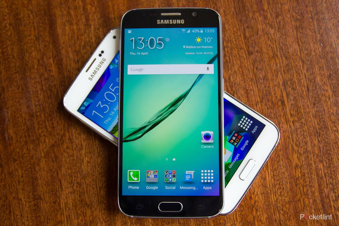
Visually there isn't a huge change to the SGS6 home screen over the SGS5. If there is a theme, however, it's minimalism. It's the continuation of a gradual cleaning up of Galaxy devices, the S6 being incrementally tidier than the S5, something that's present on lots of levels.
A new feature is the ability to change the "screen grid" in TouchWiz on the S6. You can have a 4 x 4, 4 x 5, or 5 x 5 grid, essentially changing the size of the layout on the display. Choosing 5 x 5 means you can get more on, but we prefer to leave it empty as it all then feels less cluttered.

The weather clock widget shrinks to half the size, losing the bloat and the background image, without losing any of the information. The AccuWeather system that sits behind it adds colour and sophistication, while also giving a better hourly forecast. The widget can be resized, if you want it to be larger again.
Folders lose the fuss too, dropping the file folder graphic and just giving you a square of icons. That means you can see nine tiny icons, rather than just six as you could before. It's a bit like Apple's iOS in that sense.
The system icons across the top have also been tweaked. They are a touch smaller, but as the battery icon shrinks a little, the percentage value increases in size, so it's easier to see.
But the biggest change you'll notice, and this applies to the apps tray too, is the adoption of a 3D parallax effect. Yes, it was something that iOS introduced, but we like it here too - it adds depth and makes something static look more dynamic.
Apps tray
The apps tray looks very much as it was previously, adopting the wallpaper as a background and the icon still has to sit in the bottom right-hand corner. It's a different beast, however, and that much becomes clear when you hit the edit option at the top.
Samsung has made a change that runs TouchWiz-wide that eschews the three dot symbol in place of words in caps for options in its apps. It's probably part of an effort to distinguish itself from all other Android devices, but it's neatly done.

Samsung Galaxy S6 (left) vs Samsung Galaxy S5 (right), apps tray editing
Hit the EDIT button and you can shift around icons, make folders, disable apps or uninstall them. In fact you can do everything that was previously enabled by a menu that broke out each option individually. So things are much tidier now, again, with Samsung stripping away the bloat. You can't uninstall everything (like Microsoft's preinstalled apps) but those you can't uninstall, you can disable, so they're not running or requesting updates.
There's one option that's been removed and that's Galaxy Essentials that's in the SGS5 menu. This is simply a link through to Samsung's own Galaxy Apps store, which still exists as an independent app on the S6. One thing you can't do is opt to arrange alphabetically, but you can switch things around manually as you wish.
Recent apps, home and back
The SGS6 uses the same system of physical home button and flanking recent apps and back buttons to control the device. As these are hardware based, there's no option to switch layout or customise the visual appearance.
One of the options that now seems to be missing is the ability to control the duration that the touch controls stay illuminated. Previously you had 1.5 seconds, 6 seconds, always on or always off. Now you get about 2 seconds and no options, but we're happy with that.
The SGS6 introduces a new shortcut on the double tap of the home button. It now launches the camera and it's a great feature. Previously this launched S Voice - Samsung's on voice control system. Both will launch Google Now with a long press.

Tap the recent apps button and both offer a card style view, pretty much the same as stock Android Lollipop, but offering a close all option at the bottom on the S6. The S5 also offered a link through to see how much memory the running apps were consuming. Again, this has been tidied away.
A long press on the recent apps buttons powers one of our favourite shortcuts. This opens the split screen (multi window) option. If you're in an app like Twitter or Maps, that long press will see the app fill half the display, leaving the other half open for another app. Want to read your emails while keeping an eye on the map? This will let you do that.
There are also icons on the cards in recent apps view that will let you open up in split screen as there were on the SGS5, but the long press is much more convenient.

There's also the option to open your app in a pop-up window. Placing your finger in the top left-hand corner and dragging in gives you a pop-up window. This can be shrunk (like a Facebook Messenger chathead) and placed as a floating icon on the home screen.
In this sense, the SGS6 is borrowing functions from the Galaxy Note 4 and making them slightly tidier. Pop-up windows are perhaps less useful on the 5.1-inch display of the SGS6. Although you can be looking at one thing over the top of another, it's so fast to switch between apps we struggle to see any real world use case.
Lock screen
Fitting with the theme of cleaning up the bloat, the lock screen has had a small makeover too. Previously you could choose the unlock effect - stone skipping, watercolour and popping colours typified the sort of nonsense that prevailed. The Note 4 added abstract tiles and ripple and the SGS6 has ditched the lot, along with some of the options for information you can have on your lock screen.
That might be because Android Lollipop's lock screen notification system will dominate for many at busy times - that's also behind the ditching of lock screen widgets, like the S Health step tracker. There's also a great Ken Burns effect with a slight zoom out on your wallpaper when you wake the phone up. It adds a touch of class.
Aside from that there's a camera and dialer swipe shortcut. The former you're unlikely to use because of the double tap home button shortcut, the latter might be of use if you have no security in place. Given how well the new fingerprint scanner works on the SGS6, that's unlikely too, so we've yet to actually use it.
From the lock screen you can also swipe down to access quick settings toggles and notifications.
Notifications and interruptions
With Android Lollipop changing how notifications and interruptions are handled, the card style alerts behave as you expect them to appearing on the lock screen and when you swipe down from the top of the display.
However, Samsung hasn't fully adopted Android's interruptions approach, instead using a Do not Disturb function, which is pretty commonplace on other devices too. Through Do not Disturb you can allocate quiet times, but indicate what can disturb you - alarms, calls, messages, VIP contacts, events and particular apps.
Samsung's approach actually gives you a lot of control. You can easily have your device go quiet at particular times (at night for example) but still let certain people through (like your mother).

What Samsung hasn't used is Android's all-priority-none system of notifications control. In doing so it's retained a little more flexibility, as in stock Android, none really means none when it comes to alerts, so not even alarms will sound.
You can still go through and decide what you see on the lock screen, with the option to hide sensitive information. To access these options, you need to tell the phone to show content on the lock screen, and then in individual apps specify what contains sensitive information and opt to hide the content.
If you don't mind people reading your messages, or can't be bothered with the constant unlocking, you can have the setup that suits you. This is the same as it is on the SGS5 with Lollipop, but it takes some fiddling to get your head exactly around how it works.
As we've mentioned, there's no all-priority-none system which would also be accessed through the volume controls on a stock Android device (as well as HTC Sense 7). Instead, Samsung lets you have control over all the volume levels (ringtone, media, notifications, system) at all times.

That means you can change the volume of media before you open it, which you can't do directly on stock Android, and you can change the volume of notifications when you're in media, which HTC Sense doesn't let you do. If you're in an actual song view, rather than just the overview from the app (music for example), then it's just the music volume you control.
The problem is this. You can't actually silence the phone using the volume keys - it only goes to vibrate. This is true of the previous version of TouchWiz too. To silence it, you'll have to swipe down and hit the quick settings toggle twice. But as we said, you can do this from the lock screen, so it's not too fiddly.
Quick settings, settings
Android has a great quick settings gesture. A two-finger swipe down opens up the quick settings, so you can really quickly punch the options you want. Unfortunately, Samsung killed it in TouchWiz on the SGS6.
On the SGS5 you have a quick settings panel with 22 icons, accessed with a two-finger swipe. On the Note 4 on KitKat you have 21 icons, access the same way. On the SGS6 you have nothing.
A single finger swipe on all devices to open the notifications pane gives you access to a single line of settings toggles that swipe left and right. You can edit the shortcuts you see, and move those you most commonly need to the top of the list to appear first in that line, so that sort of replaces the need, but you can only, for example, toggle Wi-Fi on and off, rather than being able to tap below the icon to select the network you want to connect to.

SGS6 (left) loses Quick Settings, SGS5 (right) has lots
Open up the settings menu proper and you are faced with a top section of quick settings again. On the SGS6 this is a grid of up to nine apps, six by default. It's a feature adopted from the Note 4's version of TouchWiz, but more elegantly managed.
The problem that Samsung had to tackle was the haemorrhaging of settings options. On the SGS5 on Lollipop the settings menu has 62 options. On the SGS6's version of TouchWiz you have 32. The result is that you don't feel overwhelmed as soon as you start scrolling.
As we've seen, the S6 has fewer options in many areas than the S5, but really it's about organisation. The options to view by grid, tab or list are also gone and on the SGS6 it's list only, which we prefer.
TouchWiz on the S6 then colour-codes all the settings: connections are blue, device are orange, personal are yellow, system are green. The colours are irrelevant, but they add cohesion. The S5, by contrast, has five blue icons, two green and one yellow in the connection settings, for no discernable reason. They probably made sense to someone at some point in the past.
In short, Samsung has done a great job of cleaning things up. In some cases it's as simple as moving the power saving options into the battery section, but some features have been dropped on the S6 - air browse, air view, toolbox, one-handed operation - and we don't miss any of them.
If you're struggling to find settings, both also offer a search function (again an Android Lollipop addition) - so organisation might be a moot point - but we know that Android users love to tinker with settings. We do miss quick settings though and the loss of that two-finger swipe is keenly felt.
Cleaning up stock Samsung apps
That tidying theme continues through Samsung's own apps. S Planner is now more elegant and cleaner to look at, but might struggle in the face of the stock Android Calendar app. The same applies to Messages, the stock SMS app: its mustard yellow colour scheme might drive you straight to Android's Messenger app.
The Dialer and Contacts have been tidied up too. Previously on the SGS5, the Contacts app was really just a tab of the Dialer. Open one and you can tab across to the other. That much is evident when you open the settings: you have both call and contacts settings options, whichever app you originally opened.
On the SGS6 things have changed to split them up, so the Dialer looks cleaner and offers a floating action button - standard for Lollipop - to access the numberpad. You can still tab over to contacts, but it's not the actual Contacts app. Open the Contacts app itself and it's dedicated to contacts, with no dialing options.

Although it's rearranged in this fashion, when you tap a contact, it opens the same card, with the same information, layout picture, etc. We like the material design influence here: scroll up and that high res picture shrinks as things merge into the top bar, with different contacts getting different colours. It's all much slicker than it was before.
When it comes to Samsung's stock entertainment apps, one of the things you'll notice is that other devices has now been axed. There's no option on the SGS6 to access media on DLNA devices - so there's no option in the Videos or Music to access content on other devices. There's also no integration of other photos into the Gallery.
That reduces the options and cleans things up, but it's a slight blow to functionality. Samsung has been offering AllShare for a long time and that seems to have been removed. That's not to say that S6 won't share, as it will. Tell it so send content to your Xbox One and it happily agrees; but if you want to access your network media drive, you'll need to download an app to add that functionality.
In some ways, this reflects the shift to cloud storage and the proliferation of streaming services we now all use. Things like Spotify and Netflix change the way we consume media and the SGS6 feels like it's natively moving away from some of the options of the past.
You'll see the same treatment of tidying up in the Internet browser, Calculator, and so on. Samsung's S Health app has had the treatment too, ditching photographic backgrounds in favour of a card view that feels much more like material design.
Keyboard
Manufacturer keyboards are under attack. For a long time, third-party options like Swiftkey have offered a better experience than many. It's slick and fast, quick to learn where others are rather slow. In Lollipop, Android's stock keyboard is also very good and in many cases, better than the efforts of manufacturers.
The SGS6 TouchWiz keyboard is pretty good. One of the things we like about it is that it manages to squeeze in the number row where others don’t (although you can customise some keyboards to add numbers). One of the advantages that Samsung offers is those off-screen controls. That means you don't lose a section of the display as you do on most other devices. As a results, the keyboard can offer more without eating more space.
The options are pretty much the same on the SGS5 and SGS6. Both offer prediction, correction and swipe entry, but the SGS6 is much better looking visually. The SGS5 stock keyboard looks archaic.
SGS6 Camera
The camera is one of the key points on any smartphone these days and the SGS6 has a fantastic camera. The app has also had a substantial facelift over the SGS5.
First of all, you can hide the left-hand options (effect, HDR, timer, flash, settings) so they don't get in the way. Tapping the arrow lets them drop down for instant access, so things feel cleaner.
The Mode selector is also much improved. As with elsewhere in this latest version of TouchWiz, Samsung has dropped the over-the-top images in favour of flattened minimalist icons.

The settings menu has also changed into a regular menu, rather than the pop-over grid offered before. Somehow, sticking to a straight list of options makes it easier to select what you want. The grid suggested that you'd be in there all the time, playing with the settings, but we feel that the list option reflects the reality - you select your preferences then probably leave them alone most of the time.
We love the fact the HDR is now Auto as well. Whether that's purely down to software (or if there's a hardware enabler somewhere) we can't tell, but we'd love to have this option elsewhere.
Samsung Galaxy S6 vs S6 edge
The changes we've detailed for the Samsung Galaxy S6 also apply to the S6 edge. The S6 edge is effectively a premium version of the same device, adding the curves to the edges of the display and coming with the higher price tag.
The experience between the two phones is very much the same and if you're wondering which you should choose, we've broken that down for you.
READ: Samsung Galaxy S6 vs S6 edge: Which should you choose?
We've also detailed what the edge will do in a separate feature. In short, you can have colour notifications for particular contacts, as well as the ability to swipe in to get to those favourite contacts quickly.
There's also a night mode, giving you a little bit of information along the side of the display for a quick glance without waking up the entire display.
Summing up
There's a lot more to the Samsung Galaxy S6, TouchWiz and older devices than we have the space to detail here. But the shift is obvious. Samsung is refining features, it's ditching the bloat and even though it arrives with Skype, OneNote and OneDrive, it doesn't feel as complex or overloaded as it did before.
Instead, the latest version of TouchWiz lets you focus on the stuff that matters. Some of the superfluous features have gone, menus have been condensed, but Samsung has done so in a way that maintains its identity. This is a fusion of lessons learnt through the SGS5 and the Galaxy Note 4 and it bodes well for the Galaxy Note 5 later in 2015.
There's currently no indication if or when older devices might be updated to a refreshed TouchWiz experience, but Samsung tends to do these things little by little, rather than in big lumps. But we hope the SGS5 gets a refresh, because TouchWiz is now slicker, more refined and more sophisticated than ever before.