As part of the development process for Android 11, OnePlus has been releasing a new version of OxygenOS; its custom operating system.
What made OxygenOS so appealing to many in the tech community was how close it was to looking and feeling like a vanilla Android experience. But with version 11, it's taking quite a big step in a different direction.
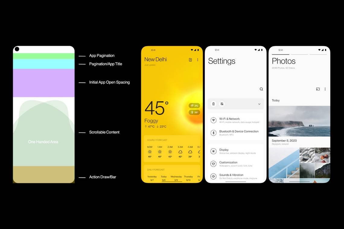
OxygenOS features a complete rethink in terms of design and takes a similar approach to the hierarchy of headings, subheadings and white space found in Samsung's OneUI and Huawei's recent versions of EMUI.
In a recent community blog post, the company has outlined its reasons for doing this and a lot of it comes down to user-friendliness and aesthetic appeal.
As always with anything OnePlus does, a big part of any change is down to feedback it receives from its community, and its final decision on how various app headings look is a direct result of that.

The rest of the content within apps - particularly elements that are designed to be swiped and tapped on the touchscreen - have been positioned to make it as easy as possible to reach while holding the phone one-handed.
With most people holding their phones with their thumbs near the bottom of the display, it makes sense in that regard to shift the touchable elements down the page.
It notes in its reasoning that as phones (and their screens) have become larger over the years, that the Android user experience hasn't really adapted to match that development.
Whatever the reasons, it's an interesting change in philosophy from a company that made a name for itself offering a highly customisable version of Android that was also lightweight and close to stock.
It's too early to tell how consumers will respond to the change, but by going with a UI that's close to the big-name competitors it may attract more buyers outside of its usual fanbase. After all, Samsung and Huawei both sell more phones than OnePlus.