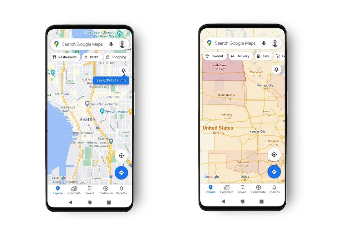
Google is working on rolling out an update to Google Maps that includes new layers that show COVID-19 infection rates in the local areas.
This new map information is designed to show critical information about the virus in areas where you might be travelling so you can evaluate your travel plans and assess how, when and where to travel.
- Google Maps is rolling out updates to make nature and city maps look better
- Waze update makes regular trips easier to manage, teases Amazon Music integration
If you have the update, you should find the option to add a layer to the maps with "COVID-19 info". This then shows the average amount of new cases per 100,000 people. The data will also show whether the infections in that area are rising or declining with a colour coding to show what's happening at a glance:
- Grey: Less than 1 case
- Yellow: 1-10 case
- Orange: 10-20 cases
- Dark orange: 20-30 cases
- Red: 30-40 cases
- Dark red: 40+ cases
Google says this data is being gathered from "multiple authoritative sources" such as Johns Hopkins, the New York Times, Wikipedia and more.
This data is also available at country level for 220 countries that Google Maps currently supports with more local county and city-level data available where possible.
These updates are a welcome addition to Google Maps which was already improved earlier this year when the company added alerts to make it easier to travel safely on public transport.