Sony Interactive Entertainment has lifted the lid on the user experience for the PlayStation 5.
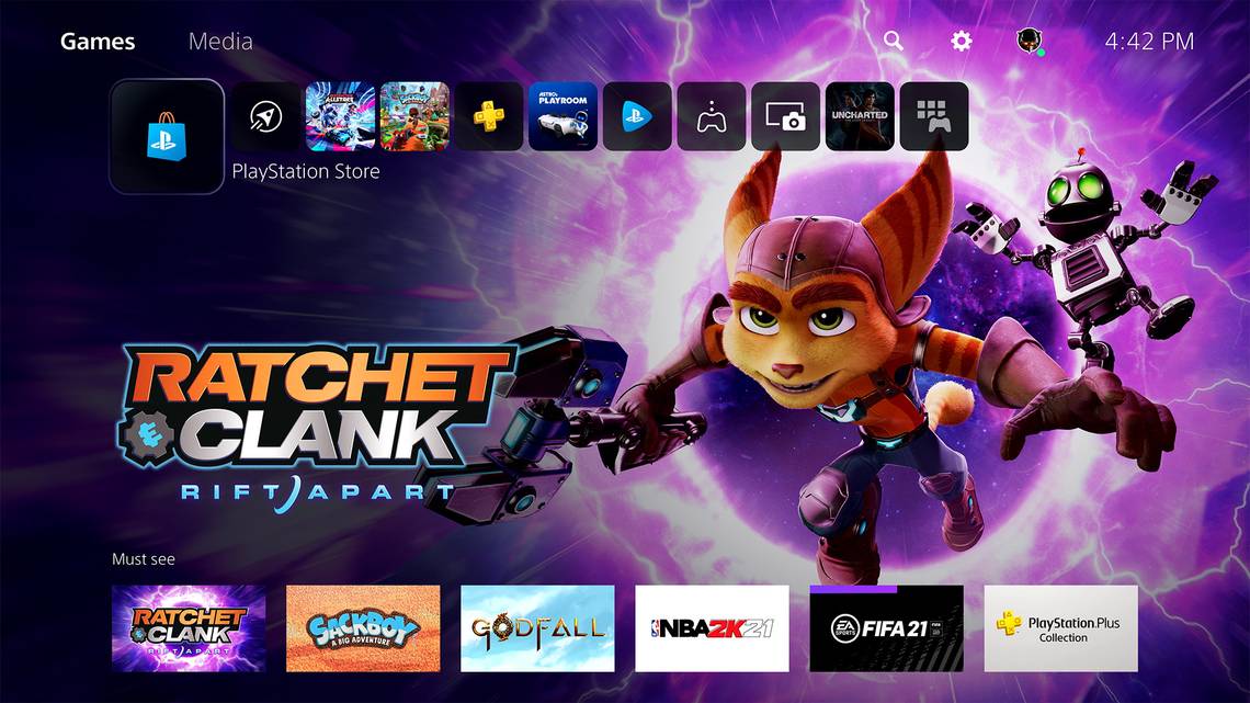
Detailed in a reveal video posted today, the PS5 UX has elements of the media bar that runs across the PS4's homescreen, but minimises it and adds a lot more.
There is also a new Control Center - accessible in-game through the "tap of one button". You no longer have to leave the game screen to access your profile, controller battery status, power options and more.
There are also Cards that offer different updates and options for the game you are currently in. These include Activities - different levels or tracks (in a driving game) that you can see your progress in and immediately jump into, without having to navigate through the game's own menu system.

Very cleverly, you even get playtime estimates on how long the level could take to finish - handy if you only have a set amount of time before dinner or bed.
Some in-game Activities can even offer tips on how to complete different objectives, so you don't have to pause and check out a walkthrough on YouTube or online.
The main homescreen this time around is more content rich than before, with game hubs having their own backgrounds and easy access to a wealth of information and segments.
It all looks much cleaner than the Xbox UI that is coming to Xbox Series X and S, and has started to roll out to Xbox One already. However, we'll let you know how they work with the next-gen consoles when they arrive in the Pocket-lint test labs.