A long time ago in a galaxy far, far away Microsoft made a move into smart, connected, mobile devices that were relatively unchallenged. The early versions of Windows CE drove Pocket PCs, long before the modern smartphone had taken off.
Our quick take
Windows 10 as a smartphone platform is something of a mixed result. It's a more feature-rich platform than Windows Phone 8.1, with a lot of new options in the mix. There's more integration, such as Skype, and better handling with Outlook and individual Office apps, for a smartphone experience that feels more mature.
At the same time, we're not totally taken with the design. Some of this is subjective, naturally, but we don't think that Windows 10 makes best use of smaller displays, so it's slightly awkward at times. It also doesn't feel as snappy as rivals, the mess of the settings still exists and we're not entirely convinced it's as stable as it could be, although that could very well be device dependent.
The strengths of Windows 10 remain very much as they were before: Live Tiles are a joy to use, making for a home page experience that we find refreshing and informative.
But some of Windows Phone's bugbears still pervade. It doesn't feel as advanced as iOS or Android, there's still gaps in the app offering and the Store is a mess. That can change, this can be a better platform, but as it is at the moment, Windows 10 on your phone feels like it still needs to evolve.

Windows 10 Mobile - 3.5 / 5
| FOR | AGAINST |
|---|---|
|
|
Window's life on mobile devices progressed from this place in evolutionary steps up though Windows Mobile editions, with devices still feeling very much like a small computer, before a major shake-up with Windows Phone, shifting the focus to compete more assertively with smartphones.
For some, the game was already up, with Apple's iOS and Google's Android setting the pace for modern smartphones, leaving Windows Phone scrabbling for traction.
Windows 10 is a single platform approach from Microsoft. It's designed to give consistency and uniformity across Windows properties, with Xbox, desktop, Surface and Lumia all running Windows 10 and sharing universal apps. Microsoft's grand plan is ambitious, but rarely are things so easy: on smartphones, it's still attracting the name Windows Phone 10 or Window 10 Mobile, so that people know what you're talking about.
That makes things slightly messy from the start, but the idea is to bring uniformity and synchronicity, whether you're sitting at your desk, or sitting on the deck of your yacht. Regardless of whether you use a Windows PC, just what is Windows 10 like as a smartphone platform?

Windows 10 Mobile review: Design
We saw a lot of Windows 10 on phones before it launched thanks to the Windows Insider programme. It was immediately evident that across Windows, Microsoft's plan was to bring more of the mobile to the desktop. That was certainly the case with Windows 8, leading to some confusion that's mostly been eradicated with Windows 10.
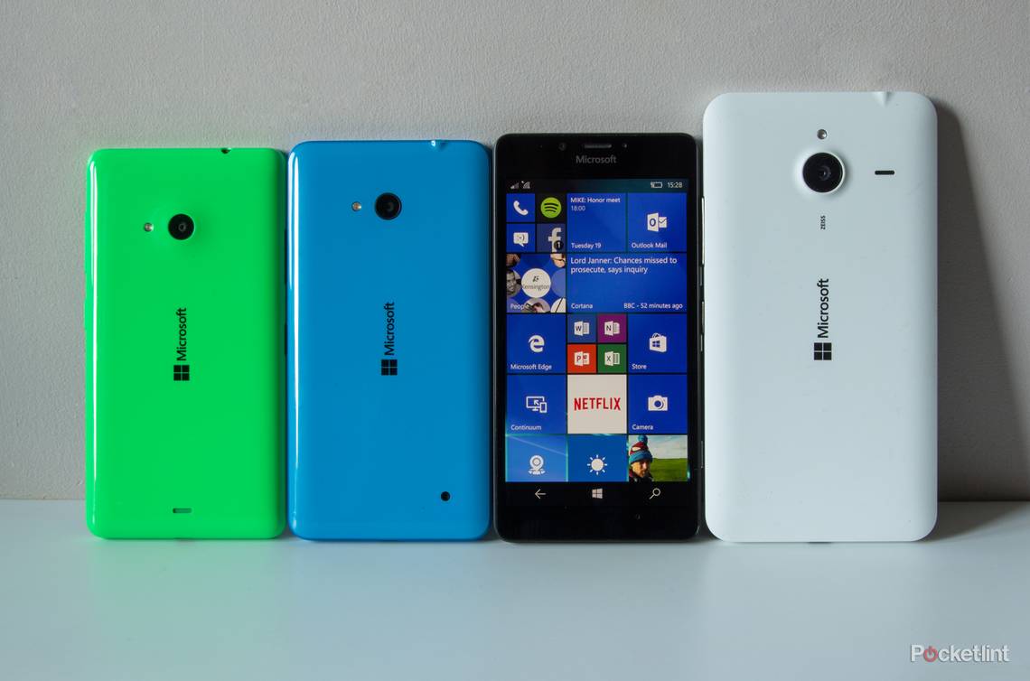
On a mobile device, then, you'll find that lot hasn't changed. Fire up Windows 10 on the Lumia 950 or 950 XL - the two launch devices for the new platform - and things look familiar. The homepage is still based around Live Tiles, refreshingly unique when compared to iOS's unchanging home pages. Pinning apps, changing background pictures, colours, and light or dark themes, is still very much the order of the day on Windows 10.
The biggest design change is in organisation. The apps menu is more distinctly alphabetised, with a search bar at the top of the page for instant access. Things look clearer, so we find that scanning the list of apps is faster than before. You can still tap on a letter and access an alphabet grid to jump to where you want too.
There's also been a lot of organisation in the main settings menu. We've been criticising this for several years. As Microsoft added more to Windows Phone, and Nokia added more on Lumia devices, you were left with a fragmented settings menu that was repetitive and disorganised.
Windows 10 goes some way to addressing that, with major categories for settings, like System, Devices, Personalisation, whereas previously all the sub-elements of those sections were displayed at the top level, leading to lots and lots of scrolling.

But it's perhaps not the masterstroke of organisation that we want: there's still an "Extras" category, which acts like a general sewerage pipe for anything that doesn't fit elsewhere. You have "Colour profile" that should be with the Display settings, you have "Network services" that should be in the "Network & Wireless" section. (We're not entirely certain what the garbage code is at the top of the right screen above, but we're sure it's not supposed to be there.)
We suspect that this is due to a lack of platform flexibility, offering standard settings that will apply to all devices in one place, then those additional features that might only apply to a specific device or manufacturer in the "Extras".
One thing we'd note in the new design with Microsoft's update to Windows 10 is the change of some of the iconography, or introduction of new icons. Generally speaking, icons seem to have shrunk, wording is smaller and lines are finer. We imagine it's a move pursuant of increased sophistication, but in some places we see things floating in a sea of space, as though the design is unfinished. Where it works on the Xbox, or desktop, it doesn't necessarily fit on mobile.

Take, for example, the quick actions area, as pictured above. The icons used in Windows 10 (bottom) by default are smaller than Windows Phone 8.1 (top), they're less impactful, and text has been knocked down from CAPS, while the boxes they sit in are larger. It feels like wasted space and it doesn't improve visual clarity. As for the overlap of the Wi-Fi and location indicators in Windows 10, that appears to be an anomaly, it doesn't always appear like that.
Simply put, we think Windows Phone 8 looks better in some areas. You can change the text size, however, and it is worth fiddling around with these settings, as once the text is larger, things look a bit more balanced. But the case remains: there's a lot of space that doesn't look used to best effect, and we suspect this has been driven by creating a new visual identity for the desktop experience.
Elsewhere there's been a liberal dumping of one of Windows Phone's design foundations. When Windows Phone 7 launched, lots of apps, both native and third-party, wanted to encourage you to swipe through pages horizontally. There would be a tease of something just off the page, headers that flow over the edge, so you swipe across and you're looking at a different section of the app.
It's still supported in some apps, but the design language is very different, cleaner and simpler, showing complete headings tabs, rather than that messy tease of information over the page. Windows 10 is more efficient in the use of space in that sense, although it jars slightly with the point we've just mentioned above, where things don't quite work. It's a jump down from Windows 7 and 8 where the message was mostly "BIG!", and now it's "small!" on Windows 10.
Windows 10 on your phone is, then, something of a design mish-mash, lacking the consistency of iOS or (slightly lesser) cohesiveness of Android. We can see these elements flowing into Xbox and Windows PCs, but the scaling doesn't quite work: one-size fits all is a nice aim, but doesn't necessarily result in your new smartphone being the best dressed.
Windows 10 Mobile review: Start and personalisation
One of the things we've always liked about the modern manifestation of Windows is Live Tiles. Doing away with the need for greedy widgets as proffered by Android, or liberally ignored by iOS, Live Tiles have always provided glanceable info, be that social, news or just a changing photo to brighten things up.
That's very much the new Microsoft, and very much Windows 10. Having first appeared on Windows Phone 7, Tiles are still pinned to your home page so those apps and services you regularly use are at your fingertips.
These can be resized, made more or less transparent or placed in folders to cram a little more in and we still think it's a good system for mobile devices.
So there's plenty of personalisation options for your home page, or Start if we stick to Microsoft's terminology, so you can get the arrangement that you want. You don't have the same range of options as Android, where you can literally change every single aspect of your smartphone (either natively or through apps), but we like the Windows 10 home environment and Live Tiles remain its most distinctive feature.
There's also a neat trick that Windows has borrowed from the iPhone 6 Plus. If you press and hold the Windows button at the bottom, it flips to one-handed mode, dropping everything down to the bottom half of the display and within easy reach of your thumb. With smartphones getting larger, it makes it easier to hit any controls that might be at the top of the screen, and remember that the Lumia line has some large devices that will benefit from this.
Windows 10 Mobile review: Windows Hello
One of the new features of Windows 10 is Hello. This is the umbrella term for biometric sign-in on Windows devices and finds itself here on smartphones. That's not so surprising, with Apple offering TouchID and Android offering Nexus Imprint or other fingerprint-based securities on other devices.
Obviously you'll need the hardware to support Windows Hello, and on new devices, like the Lumia 950, this is in the form of iris scanning. This might sound like a super-futuristic feature, but we've found it to be a pain in the neck, or more precisely, a poke in the eye.
It works with a red illumination on the front of the new handsets, to look at your iris details and unlock the phone when it recognises you. But if you're a regular phone checker - and the estimates are that people check their phone 100 times a day - then that's 100 times the thing wants to peer into your eye, and we find it a bit dazzling.
Fingerprint scanning is supported on other devices, like Windows laptops, and we're praying it comes to Windows 10 smartphones in the future, as currently, we'd rather turn off Windows Hello than be constantly blinded by it.

Windows 10 Mobile review: Quick settings and keyboard
One of the major additions to Windows 10 is quick settings. This is rather like the Android Quick Settings pane, expanding on the shortcuts offered in Windows Phone 8, with a larger grid of options.
This means quick access to things like flight mode, camera, location toggle, mobile hotspot and so on. You still have the option to select those options for "quick actions" as you could before, but now with the expanding drop-down grid of 16 as well, which is much more convenient.
Another core update is the keyboard. Windows Phone has struggled with keyboards, especially compared to Android. There has been progressive improvement, but Windows 10 takes a leap forward. It sits on the foundation of Word Flow, the keyboard that offers trace entry (as you'll find in stock Android, SwiftKey, Swype), with predictions for your next word for pretty speedy input.
But there's more personalisation now available that makes Windows 10's keyboard competitive again. You can change the size - it's often taken up too much space previously - as well as shifting the location left or right, again a nod to one-handed use.
Finally there's the addition of a cursor. This little digital nubbin sits in the keyboard, rather like a ThinkPad TrackPoint. Press this and you can move the cursor around the display, perhaps to select something further down a list. Overall, this is all change for the better.

Windows 10 Mobile review: Outlook, Office, Skype
When it comes to stock apps, Windows 10 on phones is leveraging other portfolio brands more aggressively than it has done before. The calendar, for example, is now Outlook Calendar, with a liberal redesign and the introduction of an agenda view for your appointments, which is very welcome. Overall, it's a much stronger calendar than before and much clearer to read.
Outlook too is now handling your email, rather than the mail app before. It's more cohesive now, offering multiple mailboxes in one place, so it's easier to manage your mail, as you can just switch inboxes via the tray menu on the left-hand side.
As Microsoft has ditched the horizontal scrolling (as mentioned above) this means you have swipe options for individual messages, so you can set flags or archive messages to get rid of them. You can change the view to "flagged" to view those you've highlighted, rather like pinning in Google Inbox. The Outlook experience is reasonable, but it lacks the charm of BlackBerry Hub or Gmail, and we feel it could be made stronger. For example, rendering emails full of formatting is poor, leaving you to spend time zooming in and out, or having to sweep across to see what's dropped out of view.
Office was an umbrella offering previously, now replaced with familiar apps for Word, Excel, Powerpoint, to sit alongside the existing OneNote app. We've been impressed with Microsoft's strategy for Office apps, and now it feels much better. That said, with those apps available on iOS and Android too, and offering very much the same experience, it's not exclusively Windows 10, but seamlessly working from desktop to tablet to smartphone has never been easier thanks to Office 365 - and there's a free 1 year personal subscription hiding in the Lumia Offers app on the new Lumia devices, which is well worth claiming.
Another Microsoft property is Skype. The communication platform is increasingly integrated, making a move to challenge messaging apps more directly than it has done before. There's now a Skype video app, with Skype messages now integrated into the messages app alongside traditional SMS, a little like Apple's iMessage or Google's Hangouts.
The splitting of messages to form a stronger instant messaging proposition will probably be welcomed by some, but with so many messaging options available, mobile users might not readily flock to Skype, and the move from the familiar light blue app, to a system integrated app is quite a shift.
There are some clever features, for example moving from a voice call to Skype video call, but there's also potential for confusion, just as there is with iMessage. Skype calls (voice or video) are logged alongside regular calls as they are with messages, so when you go to make a phone call, you'll see your Skype activity there too in your history. If you're placing a call, you need to make sure you select the right contact, or you might start Skyping someone by accident.

Windows 10 Mobile review: Windows Maps
With Windows 10 there's a new version of Windows Maps. Maps has charted an unusual path through previous Windows versions. Windows Phone 7 launched with its own app, but then Nokia pushed its own maps, slowly evolving Here Maps over the course of the next few years, often with both appearing on Windows Phones.
Windows Maps in its latest guise is still powered by Here (we assume it uses Here mapping data), and aims to be a universal app offering the same experience across your desktop and smartphone.
In this iteration, Windows Maps aims to integrate everything, where previous Here offerings had separate apps for different actions. One of the benefits is offline mapping, allowing you to download the region maps you need for directions without needing to use a lot of data.
With this new integrated Maps everything happens in the same place. You can search for an address or location and then plot a route, either driving, walking or on public transport. That's the same as it was before, but now when you want to commit to driving, it happens in Windows Maps, giving you turn-by-turn directions and voice guidance. Previously, you'd then access Here Drive for the directions.
So it's a change for the better, more comparable with the integrated offering that Google Maps presents, although we still feel that Google Maps is better visually and faster and more accurate when finding results. However, we've used Windows Maps for driving and found it a perfectly good system.
Windows 10 Mobile review: Apps
If you're a fan of mapping, you'll find that Windows (phone) 10 is still plagued by one of the problems that's been in place since its inception: apps.
Maps is a good example: search for map apps in the Store and you'll get a range of results from varied sources, with many paid-for apps that appear with the same icons as free versions, or titles designed to confuse. Search for Here Maps and you're presented with something that looks like a fake, search for Google Maps and you'll find googMaps, GMaps, gMaps, for example. It feels like the app Store needs some housekeeping, and it still feels the way it has done for the past few years.
That's not to say that Windows is lacking apps: the aim of having one platform is that you can have universal apps in all places and it's more attractive to develop an app that will work on all the Xboxes and PCs, and not just the smartphones. That should provide some impetus to push apps across devices, as the user base is now much larger in theory. We're only at the start of the journey here, but compared to Android and iOS, some way behind.
Microsoft says that porting Android and iOS apps will be easier, but there's a feeling that Windows 10 is behind the curve with apps. When something new and exciting launches, Windows is still on the back burner and things like the controller for your smarthome heating or the latest buzz social app won't be there.

Windows Phone 10 review: Cortana, Edge
Two more universal brands being leveraged on Windows on your phone are Cortana and Edge. Microsoft's digital assistant has been well received, created for mobile and finding its way to desktop. We like Cortana, it's well integrated, returns sensible results and can carry out a range of genuinely useful tasks for you. It's more of a useful feature on desktop now, as on phone's it's fairly well established.
We like the way that Cortana swings into action in a Google Now sort of way, presenting useful information about the day when you open it up. In Windows 10 it's cleaner and better organised than on Windows Phone 8 and the features offered keep expanding.
Looking to change the browsing experience, Windows 10 offers Edge. It's again one browser for all platforms, pushing the ill-repute of the Internet Explorer name to one side.
The new iteration in Edge makes some additions, bringing a new reading list feature so you can come back to articles and syncing across your browsers, as we've seen in Chrome and more recently Safari, for some time. We don't find it as fluid and snappy as rivals, which is something that highlights the app gap, as you need to use the browser in some places where you might be using apps on other platforms.
It's hooked into Bing by default, using that to search from the address bar. This can be changed to whatever you want (Google for example), but you have to navigate to that address first, so that Edge can "discover" it. The setting is then a couple of clicks deep in the settings, but not too hard to find.

Windows Phone 10 review: Continuum
If you're looking for Windows 10's silver bullet, then it's Continuum. While we've all been chasing the mobile working dream, we've not really seen the platform to make it all a practical reality. Yes, cloud computing goes some way to doing this across different hardware, but with Continuum, you're looking at a physical way to place a mobile device at the core of the experience.
Continuum lets you move your smartphone onto a larger display by connecting to the Display Dock, a £79.99 accessory. This is different from screen mirroring, as Continuum recognises the larger format display and makes use of the space, with its own desktop environment. Essentially, you can convert your phone into a desktop, giving you more space to work and play. There's the option to correct through a wired or wireless connection, as well as additional connections on the Display Dock for other accessories.
The idea is that you can then carry your phone with you, connect to a Display Dock, and then get back to work on a large display with a Bluetooth keyboard and mouse for example, although the connected phone can also be used as a trackpad. It's a great tool for productivity, opening up Word docs, for example, to keep typing, rather than struggling on the small screen.
There's obviously still some gaps in what Continuum will do. You can't open Netflix and play it on the big screen, for example, but we suspect that updates in the future will improve what's available, part of the ongoing saga of apps on Windows' mobile platform.
As clever as it is, there's the niggling feeling that it might not be necessary. With syncing to OneDrive, be that for images or Office documents, it's pretty easy to sit down, sign in and access your content. With the latest versions of Office you can access OneDrive docs through a browser and keep working. Continuum might seem like a hotdesking dream, but you're still left lacking the things that desktops really offer - powerful apps you might not have on your phone, like Photoshop.
It feels more like a productivity solution than one geared to entertainment and we'd choose Google's Chromecast solution for simplicity of getting media content on the big screen, which we think has more immediate consumer appeal.
Continuum, although clever, might be rarely used, unless someone in a corporation sits down and invests in that infrastructure. People will probably be seeking ways to use this feature, rather than it plugging an existing gap. We're not sure you'll get Continuum Cafés springing up and in a world where cloud access through apps rules, the instances that you'll need to use this clever feature are perhaps rare. Maybe we're being too blinkered: perhaps Continuum is the step that will enable many to move beyond the need for a traditional PC, using this £79.99 box to make that link to the bigger experience.
Windows 10 Mobile review: Updating Windows Phone 8.1 device
On 17 March, Microsoft confirmed the long-awaited news that the roll-out of Windows 10 to Windows Phone 8.1 devices was ready to start.
Microsoft also confirmed that not all Windows Phones would get the update, as some aren't powerful enough to handle it. The devices that are compatible include: Lumia 1520, 930, 640, 640XL, 730, 735, 830, 532, 535, 540, 635 1GB, 636 1GB, 638 1GB, 430, 435, BLU Win HD w510u, BLU Win HD LTE x150q, MCJ Madosma Q501.
Naturally, this isn't a huge list considering the number of older devices out there. However, if you're in any doubt, there's a Windows 10 Upgrade Advisor app that you can download to see if there's an update for your phone, as well as helping you prepare for the update.
To recap
Windows 10 as a smartphone platform is something of a mixed result. It's a more feature-rich platform than Windows Phone 8.1, with a lot of new options in the mix. But some of Windows Phone's bugbears still pervade. It doesn't feel as advanced as iOS or Android, there's still gaps in the app offering and the Store is a mess.