Windows 8 is dividing opinion. Some love the fresh new look, others find the two interface system a drag. But Windows 8 is all about touchscreen devices, and with that in mind, Intel is promising touch Ultrabooks this year and there are several touchscreen all-in-one PCs. In business, there are some pricey convertible notebooks from the likes of Lenovo that have touch and pen screens as well as keyboards.
Our quick take
Touch isn’t as fluid and natural in the desktop as it is in Metro. That’s not surprising, given that the desktop wasn’t designed for touch. In fact it might be more surprising that it works so well, with really only a few hesitations and frustrations when you try to run Windows with just a finger.
On a fast PC, with a high quality touch screen, Windows 8 touch performs superbly in almost every way. What we haven’t been able to test yet is how well it works on cheaper ARM systems, but we’re expecting the same fast and fluid experience.
You don’t have to give up mouse and keyboard to use Windows 8, but you don’t need them for everything either.

First Look - 4.0 / 5
| FOR | AGAINST |
|---|---|
|
|
But where Microsoft is obviously hoping Windows 8 will shine is on tablets – especially ARM-based hardware - that can be as thin and shiny as the iPad. The closest thing so far is the Samsung tablet PC, which is why Microsoft picked a custom version crammed with sensors to give away to developers at the Build conference last year. You can’t buy that model, but how does the Windows 8 touch interface fare on the similar Samsung Series 7 tablet, with its Metro-ready resolution and ten finger multitouch?
Great gestures
There are plenty of mouse gestures and keyboard shortcuts in the controversial Metro interface for Windows 8, but the Start screen tiles, edge gestures and other interface elements really shine with a touchscreen PC. And as Microsoft’s development guidelines to Metro developers puts it: “Metro style apps are designed to be touch first.” That means, they’re designed to work best with tablets and touchscreen PCs.
The Series 7 certainly lives up to the Microsoft promise of fast and fluid. Swiping across the Start screen or pinching in and out is as smooth and responsive as finger touch ought to be. The edge gestures are fast as well. Swiping in from the right edge of the screen opens the charm bar as fast as you can move your fingertip. Swiping down from the top of the screen or up from the bottom - to open the "app bar" in a Metro app, or the "all apps" menu from the Start screen - is just as fast and responsive. And so is swiping the next app in the stack in from the left side.
When you swipe in a new app, you can use a simple swipe to get it full screen, or you can swipe it on to the screen and then back slightly to snap it to the left of the screen, getting a view designed for the smaller window. This is so you can keep an app running - like, say, email – and on screen while you do other things.
Dragging the dividing line from side-to-side allows you to choose which side the smaller window is snapped to and is also very responsive. You don’t have to be precise; you can just flick with your thumb to resize the windows. It’s accurate as well, we’ve never had Windows mistake panning across an app for trying to swap snapped windows.

When you have the screen split between two apps, swiping for the "app bar" or the "charms bar" gives you the controls and settings for the app in the larger window. That makes sense; when you snap an app to the side of the screen it’s there to let you keep an eye on it; you probably won’t see enough detail in the snapped view to do much more than that, at least not in the Metro apps we’ve tried so far.
Switching apps when you’ve split the screen is also fast and responsive; sometimes too fast. You have to be more deliberate about where you want the app to end up. The default is to put it in whichever is the larger window - that makes sense if you’ve snapped an app to the side of the screen for reference you're less likely to want to replace it. If you want the app you’re swiping in to go into the smaller pane, you have to pause as you swipe and hold it over the pane for a moment, which feels a little fiddly until you get used to it.

Swipe in from the left hand side and right back again and you get a pane of thumbnails for all your running apps, including the desktop. You probably wouldn’t find this on your own but once you know it it’s easy. It works well whether you make the movement slow and deliberate or fast and sloppy; as long as your finger goes over the edge of the screen in both directions, you get the thumbnails.
Swipe select
In Metro, you don’t have the usual "press and hold for some indeterminate time to select", although press and hold does work as the equivalent of the right mouse button on the desktop. Instead you do what Microsoft calls a "cross-swipe".
That just means you’re using the opposite movement from the one you’d use to scroll. So if you’re on a screen that pans sideways, like the Start screen or the Photos app, you can swipe up or down on an object to select it; if you’re in a list that scrolls up and down, like the inbox of the Mail app, you can swipe sideways to select - think iPhone. Again, this is very fluid and smooth, and you can swipe on one object right after another to multiselect.
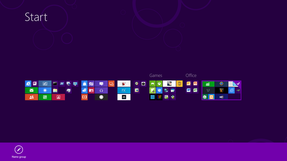
What’s not always quite as successful is dragging tiles around on the Start screen. If you drag a tile directly, other tiles move out of the way for it, so if you want to put a tile in a specific place without moving everything, you need to drag it up or down to the top or bottom of the screen and then drag it back into place.
If you want to make a new group, you drag a tile between two groups and a divider appears to show you’re making a new group rather than adding to one that’s already there. If you drag a tile across multiple groups, it pauses very slightly as you reach each new group in case that’s where you want to put it. Microsoft calls these ideas speed bumps and gravity wells, but they just feel very natural and helpful ways of working when you’re using your fingers rather than a mouse.

There are some very precise thresholds that Windows uses to decide if you’re just a bit sloppy putting your finger down when you mean to tap a tile. If your finger doesn’t move at least 10 pixels, it’s treated as a tap, or if you mean to select the tile by sliding (between 10 and 20 pixels) or if you want to move it around by sliding your finger much further (80 pixels or more). You’re never going to measure the difference between them, but after you’ve been using Windows 8 for a short time the difference between what’s a small movement to select and a large movement to drag, and that you don’t have to be completely precise, will feel completely natural.
If you drag a tile up to the middle of the top edge of the Start screen, or down to the middle of the bottom edge, the Start screen zooms out to make it easier to move tiles a long way across the screen. You can also stretch two fingers on screen to zoom out. This is the semantic zoom Microsoft talks about. The tiles don’t just get smaller, they show simpler icons too, so they’re easier to read, and that works really well for selecting groups to name or move around, or for whizzing through hundreds of pinned tiles. It’s a little fiddly for moving tiles though, it takes longer to get the hang of when you’re moving a tile directly and when you’re zooming out and in again. It’s a lovely interface idea, but even on this responsive a system you have to learn how to do it.
Moving around
Panning and scrolling within apps is buttery smooth. If you leave your finger on screen and drag, it’s like the content is stuck to the tip of your finger, if you swipe and pull your finger away the content keeps scrolling until you either tap on screen to stop it - which stops it instantly - or you get to the end of a page with a friendly little bounce.
You don’t have to be careful where you put your finger to be able to pan across the page, scroll up or down or move across and down or up at the same time; Windows 8 just automatically does the right thing to match the way you move your finger.
Metro IE is particularly good at all this, and again it’s superbly responsive as you stretch and pinch your fingers to zoom in and out. In IE, you can swipe across the screen to go to the previous or next page, something that works in several other apps, but, sadly, not everywhere. And, it never takes you back to the Start screen, for that, you have to use the Charms or the thumbnail switching pane.

Selecting links is easy as well, you just tap in more or less the right place. No matter how small the text or image, you hardly ever have to zoom in to select it correctly.
Selecting text, in IE and elsewhere, is rather more hit and miss and doesn’t match the precision of Windows Phone. The problem is starting a selection. Depending on the app, and what you’re doing, tapping might select exactly the word you want or the one next to it. And in Metro IE you have to tap twice to select a word. Once you have a selection the two white dots that appear are easy to drag to extend or reduce the selection, but if you don’t get the right starting place the first time you can have to tap a few times. There’s nothing like the press-and-hold to get an insertion point gesture that’s so useful on Windows Phone.
Putting the cursor in the middle of a word is particularly hard in the Metro IE address bar, the software expects you to want to select the whole URL or to want to edit the URL one word at a time, so tapping either selects everything or puts the cursor at the end of a word. If that’s what you want, it’s incredibly easy. If you’ve mistyped one letter and you want to go back to correct it, you’re probably going to have to give up and delete and retype that whole chunk of the URL.
Similarly, although you can double tap in Metro IE to zoom in or out, you have to be careful to do that on a blank area of the background or you just select a word. Again, this isn’t quite as refined in Windows Phone, but pinching to zoom in is so easy it hardly matters.
Two or ten finger typing
The on-screen keyboard isn’t as good as on Windows Phone either. That said, the keys are a good size and it’s responsive enough with the Series 7’s multitouch that you can type fast enough to touch type.
Tap on the keyboard layout button to switch to the split keyboard. This works best in portrait because the keys are in easier reach, but you can make the keys smaller or larger in both views and you can hit the space bar with either thumb – only reaching into the middle for numbers.

Even with large keys, this is a bit small and fiddly compared to the full size keyboard, but it’s nice to have the choice, and there will be more choices in future. You can even use handwriting, and you don’t need to pull out a pen.
Finger writing is slow, but amazingly accurate. Surprisingly, it can even handle URLs, and more surprisingly, even those with odd punctuation. Windows will suggest words for the first few letters you write, but if you ignore them and keep writing, when you get to the end of the word, Windows will get it right nearly every time. If it doesn’t, tap the word to correct it. It’s easy to draw a line to add extra letters, draw a line through the letters you want to delete and draw in replacement characters. Your writing won’t look neat, but Windows can read it, without any training, almost every time.

With a pen and an app like Journal that understands ink, you can write fast and neatly too.
Desktop touch
The keyboard is almost the same in the desktop mode but it doesn’t appear automatically when you tap in any field you can type in. Instead, you have to tap the little keyboard icon in the taskbar. Like the other buttons on the desktop, it’s easy to tap accurately. In fact almost everything on the desktop is easy to tap with a finger, so you rarely need to pull out a pen.
You can select menus and menu entries, buttons and tiny dropdown arrows on toolbars, even in third-party apps. Explorer is the only app we find a little awkward with fingers only. The arrows to expand folders are a little tricky to tap accurately when you have Explorer full screen - probably because the edge of a touchscreen is less accurate. Resize the window and it’s much easier. Tapping the checkboxes to select multiple files can be a little harder than we’d like, but the invert selection button is handy here.
Using your finger as a mouse for traditional desktop tasks works better than you’d expect, though it’s not always perfect. You can minimise, maximise and close windows easily with the corner buttons and it’s easy to drag to resize windows.
To recap
It's clear that touch interfaces have been carefully considered by Microsoft. Windows 8 is certainly most at home when directed by your finger, especially in the Metro UI. This is great if you're a tablet owner, but not so marvellous for desktop users, who may feel a little marginalised