Twitter's website could have a huge profile redesign in the works, as tipped by a current testing occurring at the social network.
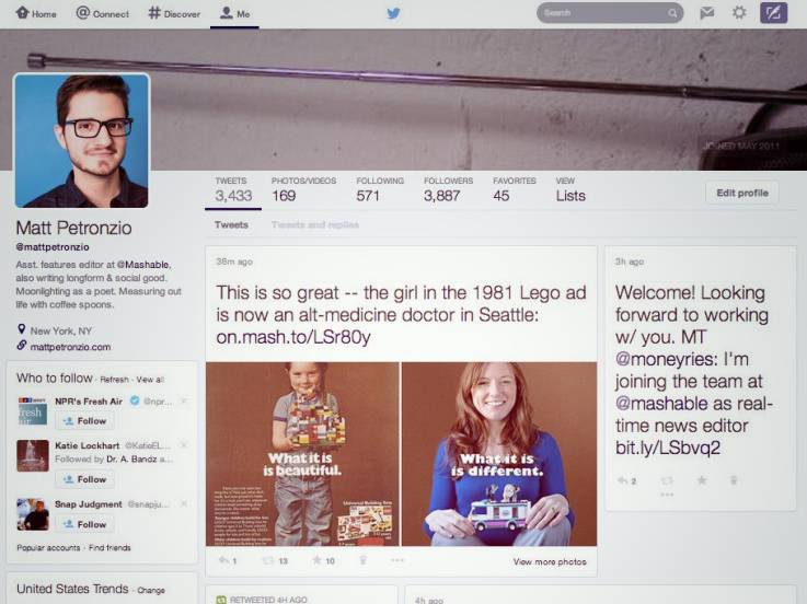
Mashable has published a screenshot revealing a new version of Twitter.com that's being shown for a handful of users. And it look totally different. The most noticeable change in the redesign - by far - is the timeline.
Tweets no longer run vertically in a single column. Twitter has instead assembled tweets in a card-like or tile-style layout. The interface is very similar to Pinterest, and it places a stronger focus on photos and content.
Other changes include blow-up cover photos at the top of profiles, resembling Google+. And below cover photos you can find familiar tabs like tweets, photos/videos, following, followers, favourites, and lists.
Echoing Facebook, profile pictures in the redesign are larger and located on the right. Additional bits like bio information, who to follow, trends and more are also on the right.
It appears the only thing that hasn't changed in the redesign is Twitter's handy toolbar at the top. It has buttons for home, connect, discover, search, direct message, settings, compose tweet, etc.
READ: What desktop version? 76 per cent of Twitter users use on the go
We've contacted Twitter for a comment to see if the circulating redesign is legit. Keep in mind that Twitter typically tests new features and design changes on a select few users before expanding updates to include everyone. There's the chance the Pinterest-esque design might never launch.