Microsoft is updating its Microsoft Office icons for the first time in five years. It's also changing the design of the apps.
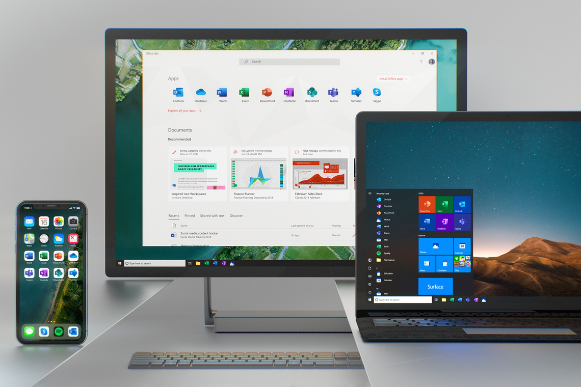
The company has been working on a single core codebase for Office, which is now available across Windows, Mac, iOS, and Android. As part of an overall effort to modernise its productivity suite, Microsoft is debuting new icons. They're meant to reflect how much Office has changed. The suite has updated several times in the past few years, adding AI-infused features and more collaboration features.
Microsoft also made a promo video to show off its work. As you can see from the press materials, the new icons no longer put all the focus on the letter for each Office app. Microsoft also ditched the document outlines in the lines of text for Word and cells for Excel. Obviously, these icons still look very familiar. Those who aren't close watchers of Microsoft might not even notice the difference.
Here's how Microsoft detailed some of the changes:
"Our design solution was to decouple the letter and the symbol in the icons, essentially creating two panels (one for the letter and one for the symbol) that we can pair or separate. This allows us to maintain familiarity while still emphasizing simplicity inside the app.
Separating these into two panels also adds depth, which sparks opportunities in 3D contexts. Through this flexible system, we keep tradition alive while gently pushing the envelope."
Microsoft said it's rolling out other design changes to Office. It'll streamlining the ribbon and carrying over its Fluent Design from Windows 10 to the Office apps. You can expect colour changes on Windows, Mac, mobile, and the web, too. Outlook Mobile is even getting an overhaul, with shared mailbox support and new gestures. You can read more about what's coming in Microsoft's blog post.