With the mobile phone market becoming saturated with new models left right and centre, manufacturers have to create new designs and styles to capture our imagination. Motorola has tried to take this creativity to heart and following in the footsteps of the v70, has created the v80. It’s a style conscious phone for the fashion set but is beauty only skin deep? We take a look, frequent the bars of Soho, Paris and Milan (well only Soho really) and see what the reaction is.
Our quick take
This phone did get the wow factor when we pulled it out of our pocket to make or receive a call when we were in a stylish bar, however the same looks didn't come when we were on the train or in the office. What's worst is that while the phone looks good, the performance has been geared to looking good rather than the usability. Yes the phone is tri-band and yes it supports Bluetooth, however while the design is its most striking feature it also offers the most problems. Troubled.

Motorola v80 - 3.5 / 5
| FOR | AGAINST |
|---|---|
|
|
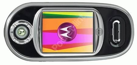
From the moment we took the phone out of our pocket we started getting looks of interest and on the surface rightly so. The shiny black lacquered case is sleek and sophisticated. The large TFT 65k colour screen takes up most of the front of the phone and because of the swivel design, covers the keys, stopping the random calls when it’s at the bottom of the bag.
Receiving calls not only initiates the polyphonic ring tones in to action, but also sends the phone into believing it’s a Christmas tree and the inconspicuous silver boarder surrounding the top of the phone lights up in sequence to the ring tone - its an interesting touch that can even be programmed to change colour depending on the caller, however anywhere other than a trendy bar will make you look like an idiot, especially when we got a phone call on the 19:17 to Reading. Additionally on the front display is the joystick and pseudo d-pad that controls the menu options on the phone. Luckily the phone locks when the swivel is closed meaning this joystick is in operable and again can’t be operated at the bottom of a bag or pocket (shame the same can’t be said for the swivel mechanism).
To get to the keypad you have to push the front display to the left. Doing so causes the spring loaded swivel mechanism into action and it’s very strong and very smooth, not too strong to double up and an attack weapon, but enough that you can tell Motorola has spend a lot of time learning the exact force to make this work. And work it does, both in practice and for the on looking crowds hovering around you.
It would be great of course if what the swivel revealed was actually worth the excitement and this is one of the downfalls of the v80- the keypad. The buttons are small, unimaginative and the finish cheap. Perhaps it’s us, but we were simply let down by the ordinary design once that swivel had sprung into action.
Meanwhile the swivel display is now vertical and ready to make a call, however even though the phone has doubled in length it’s still not that large. Rotating the swivel back to half-mast (so to speak) will turn on the built-in digital camera and the screen orientates accordingly. Using the camera we found that for the most part you will be taking pictures of your fingers rather than of the high society that surrounds you. And the bad positioning of the camera will mean that you’ll have to learn to hold this phone in an uncomfortable manner if you want to take decent pictures.
Pictures can be saved in three formats up to 640x480 and the 4x digital zoom will give you a bit of fun, but in reality only serves to make the pictures seem even more pixellated. Additionally there is no memory expansion slot for storing digital images and while you might not need to swap out your images with only 5mb of on-board memory it might have been a nice feature to add in this multimedia age.
In using the swivel the orientation software struggled to keep up and switching from vertical to landscape back to inverted vertical wasn’t smooth, in fact it looked rather sloppy.
Sloppy is the right word to describe the internal menu system of this phone while its based on the v600, a phone that we rate highly at pocket-lint.co.uk For the most part you are expected to jump between the level of the keypad and the level of the front display to select, activate and use the menu system and this is confusing and annoying.
To recap
A good-looking phone those design is its most striking feature and its worst faulting