With a totally new user interface and a re-thinking of exactly how it delivers connected services, the latest TomTom personal navigation devices feel like something of a rebirth.
Our quick take
Overall we're impressed with the refreshes that TomTom has brought with the Go 500. The size might be a little larger than you actually need, in which case opt for the smaller TomTom Go 400 with it's 4.3-inch display and £40 cheaper asking price.
But the touch response is good, the attachment to the windscreen feels solid and the navigation is as good as ever. The £199 asking price, however, seems a little high. There are no additional extras here beyond that navigation core. You don't get any other smartphone features, like access to your contacts for navigation or the ability to take or make calls, but for those who drive on busy roads, the incorporation of Traffic is a real bonus.
TomTom will be releasing a connected version of the Go, which we're sure will cost more, if you're not a smartphone user or don't want to fork out for the data. But the Bluetooth connection is incredibly simple and for us, a much better solution than asking for a subscription for Traffic.
Overall, this is a great refresh. The experience is markedly better than older generations of TomTom devices and we still very much think that if you can afford that initial outlay, then having a personal navigation device over the free smartphone services is worth the money.

TomTom Go 500 - 4.5 / 5
| FOR | AGAINST |
|---|---|
|
|
TomTom Go 500
With all smartphones offering navigation in some form, many have been predicting the decline of the dedicated navigation device. It has lead to companies like TomTom looking to evolve, to bring value and services that others can't offer. If you're reading this review, you can probably see that there's still a place for a PND and we agree: convergence is great, but TomTom still offers a better driving experience, in our opinion, than any smartphone.
The thing that makes the new TomTom Go different is that we have a new "smartphone connected" line. It's now more of a smartphone-dependent device, which we'll explore as we get into the review, but the user interface and touch experience is also closer to that of a phone than ever before.
Design
There doesn't seem to be too much you can do with a satnav device in terms of design as, like phones or tablets, it's dominated by the display. The TomTom Go 500 on review here has a 5-inch display and as such, it's a fairly large device overall.
TomTom hasn't gone down the path of pursuing thin and light. Measuring 145 x 90 x 20mm and weighing 229g, the size probably doesn't matter, given that its purpose in life is to stick to the inside of your car windscreen. But it is slim enough to slip in to a jacket pocket when you jump out of the car.

Finished in grey and black plastics, it feels solid enough and is inoffensive in the looks department. More importantly, it doesn't look out of place in your car, matching the dark interior of the VW we tested it in. There are no lights and only the discrete power/standby button on the top.
The suction mount is equally important and we like the simple magnetic attachment used to connect the satnav device to the mount. Placing the device on to the mount is easy, as is removing it, yet the magnet is strong enough to keep it in place on the roughest of roads. If the mount was to fall off the windscreen, then the satnav may head off in a separate direction on impact with the floor of your car, but we found the suction was nice and strong.

Power comes via Micro-USB which plugs into the back of the mount and the 12V power plug and cable are separate, so if you're putting the TomTom Go 500 into a car that's already fitted with USB, you can plug into that to keep things tidy. This also lets you connect to your PC for updates.
A cleaner approach to touch
Central to the TomTom Go experience is touch. TomTom, of course, has been using touch input for a long time, but many will probably remember the bad old days of resistive touch, jabbing at the screen and trying to elicit a response.
That's all changed with the latest generation of TomTom devices which are much faster and much more responsive. The display has a 16:9 aspect ratio and a resolution of 480 x 272 pixels. Although that's not a high resolution, it's adequate for the task at hand. That's because the new user interface is now simpler and cleaner. There used to be a whole host of features and options and menus to navigate around, but things have been stripped back, almost as though they've been given the Apple treatment.
In some ways, that makes us think that much of your relationship with your TomTom has to be based on trust: it does the navigating, you do the driving; you both just get on with it. At the same time, some of the information you're given is richer: with a larger display you can see more of junctions, but everything is more sophisticated and there's less clutter.
A new user interface
The TomTom Go 500 carries a new TomTom interface. TomTom has always been about mapping and you can recognise the heritage here, with maps that are kept pretty simple, with pinky-brown urban areas, green spaces and bodies of water in their respective colours.
Road labelling is clear, with names appearing on main roads, or as you zoom in. There are two main map views, the "2D" top-down view and the "3D" driving view. You can switch between the two at the tap of a button, with quick redrawing of maps as you move around.

The nice thing is how easy it is to explore the maps now. We're all getting used to the sort of experience that you get from Google Maps, which is really interactive, and TomTom's maps are now easier to explore.
In 2D mode you can pinch to zoom and double tap to zoom in on new areas, with a long press popping up the options. You can choose to navigate to that point, add it to your existing route, or more importantly, search in that area. That's a great way to find points of interest. For example, you can find a town and search for the closest Nando's for some peri-peri chicken and drive straight to it.
READ: Mapping paradise - How TomTom maps are made
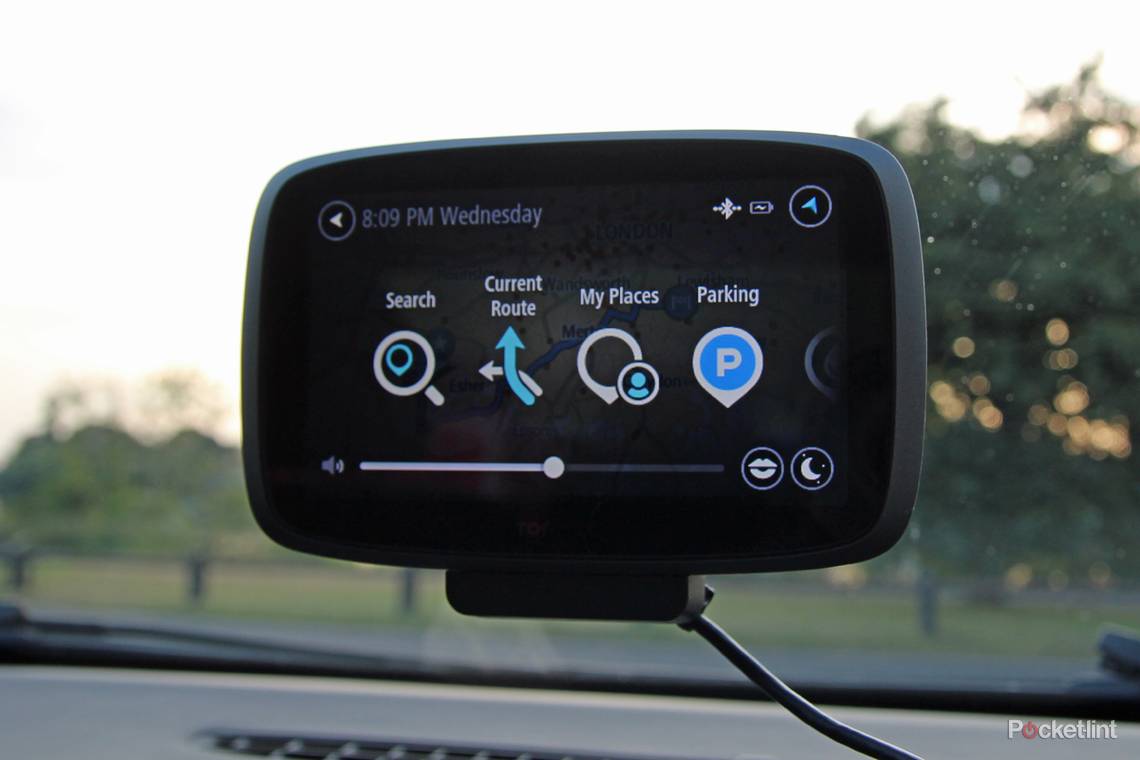
There is one button to enter the menu bar, which then overlays the map behind. It's not full of complex icons or garish colours, instead it sticks mostly to white on the dark background. The menu on the Go occupies two pages at the top level, with a swipe across to reveal the second half.
It's broken down in to six main areas: search, current route, my places, parking, parking, petrol station, traffic and speed cameras. There's an additional settings menu, but in reality, once you've set your preferences, you shouldn't need to be diving in here and it's nice to see that those extra options are kept out of the way of the main navigation controls.
Route planning
But menus aren't what any navigation device should be about: it's really about getting you from A to B. The TomTom Go 500 is noticeably faster to identify routes than before.
It's also done without fanfare. You're not offered lots of alternative options, just the best route that fits your criteria. Now as you type in your destination, two searches take place, with the results split. On the left TomTom is returning traditional location addresses, on the right, suggestions of POIs.

This avoids a previous frustration of having to choose what type of destination search you were trying to perform. Instead, it just starts searching the map and POI database simutaneously. You can, if you wish, define the search more closely, which is useful for holidays, for example. If you're searching for a Boots to buy some emergency nappies, you can search near you, near your destination, or along your route.
In many cases, the returned results are good, but as with all these types of devices, it's only as good as the database it's drawn from. This is where smartphones triumph, because Google is pretty good at keeping itself up to date. For example, TomTom couldn't see our local Boots chemist, whereas our Android device could.
Smartphone connected
Even connected to your smartphone, searching doesn't change, because TomTom isn't using the phone to do everything, it's only using the phone's data connection for a limited run of features.
Connection is simple: you pair with your smartphone via Bluetooth and the TomTom Go 500 then has access to the data that it needs. As the maps and POIs are all stored in the internal memory, data is only needed to enable traffic and speed camera information.
Traffic, formerly HD Traffic, is one element of TomTom that's unique: others offer traffic, but we believe that the detail that's poured in to Traffic makes it the best you can get. Traffic used to be a subscription-based service, but with this new generation of device it's free for all, on the proviso that you supply the data through your mobile phone.
That offers some advantages. First, you're not having to pay TomTom for that subscription and second, you have to connect your phone only when you want those services. On the downside, techophobes are faced with having to actually do something
We found that TomTom's estimate of around 7MB of data a month, based on an hour of driving per day was true: as it just counts as tethered data, however, rather than running through an app, it's difficult to put an exact figure on it, but the impact on our regular data usage was minimal.
On the road
Once you're on the road, the TomTom Go 500 gives you great route guidance. As we've mentioned, the maps are nice and clear, with the TomTom switching from day and night views as appropriate. If we've one criticism, it's that the larger glossy display is more prone to reflections than before.
Spoken directions come across loud and clear, with a selection of voices, although we opted to stick with the default which will read out road names, street numbers and so on, which not all of the accented pre-recorded voices will. There's the usual selection of male and female voices from Ireland, Austraila, USA, etc.
We've always been impressed with TomTom's route selection and here we found it to be quick to identify the route, as well as quick to re-route if we took a wrong turn.

The display neatly gives you the information you need, such as the distance to the next turn and the road you're on, as well the speed limit and your actual speed, with the background changing colour to add an extra alert if you happen to be speeding.
Speed cameras, or safety cameras as some like to call them, are included as an optional extra. You get 3 months free with your new TomTom, after which you'll be asked to pay an annual subscription of £24.99. You'll also need to have your smartphone connected to make use of this feature.
There's a right-hand column that carries the information for speed cameras and traffic data. At the top it shows your arrival time, with the column beneath being a graphical depiction of elements along your route. If there's a traffic problem, it will indicate that and show you the distance to that incident.

Speed cameras are handled in the same way, so as you approach a camera, the column will show it and if you're speeding the column background will go red. It's a nice effect, giving you that information at a glance.
Overall the driving experience is good. Traffic is as good as it was before, shown on that side bar as well as on the roads concerned, but whereas previously you could drill down to find more traffic information, have it read to you and so on, there's now a feeling that you just leave TomTom to navigate you around heavy traffic and keep you on the fastest route. In our experience, that works without a problem.
TomTom Go 500
To recap
The TomTom Go 500 offers a great driving experience, with excellent navigation and routing. The addition of "free" Traffic is a real bonus as the system works well, but at 5-inches, this satnav might be larger than it needs to be.