Android Honeycomb is pretty much the stuff of legends: the great saviour of the Android tablet, the operating system that is going to give the Apple iPad a cause for concern. Finally Honeycomb has arrived and we get a chance to see exactly what it offers. Should the iPad be scared and more importantly, is Android 3.0 Honeycomb the tablet operating system that Android users want?
We've been playing with Honeycomb on the Motorola Xoom for about 3 weeks now and it's clear that whilst Honeycomb offers some significant advantages over its Gingerbread cousin, it might not be the silver bullet that you were hoping for - not yet anyway. Honeycomb has received some negative press so far, not least because it has been reletively expensive to get hold of. For those in the UK we're now at that imminent arrival stage; those in the US have had the Motorola Xoom, but we're now on the cusp where we'll see the Google tablet OS arriving from more corners and that should not only drive prices down, but also kick start the Android Market into really taking advantage of the screen real estate that these tablets will offer.
Our quick take
By now you should have a good grasp of what Honeycomb offers at it’s core. It’s the Google Android experience adapted for the larger display and we like it a lot. In terms of comparing Honeycomb to the various takes we’ve seen on Android tablets so far, it’s a much, much, more compelling offering. It looks, feels and behaves how we want an Android tablet to act. Things like Gmail, Contacts and Calendar leave us feeling in control, and it’s a much better stab at it than we got from the Froyo-packing Samsung Galaxy Tab. Should you be excited about Honeycomb? If you’ve been holding on for an Android tablet, then yes, you should.
But there is a massive problem at the moment: it’s just too unstable. We’ve been living with the Motorola Xoom for Motorola Xoom for about 3 weeks and we’ve had crashes pretty much every day - and that’s just in casual use. The Market has crashed, we’ve had failed app installs, the browser has locked up and stopped responding, we’ve had apps quit without explanation. All these things bear the hallmarks of an operating system that isn’t ready for public consumption.
We love Honeycomb and there are so many things about it that feel right and it is useable at the moment, but it isn’t the polished experience that iPad owners get, and Android users expect. Yes, the iPad is a year older, the OS is more established, but Apple would never put a product on sale that failed as often as the Honeycomb tablet we’ve been using.
This isn’t a persistent state, we’re sure. Honeycomb will mature, other manufacturers will have their input, the consumer base will grow and the Honeycomb landscape will be richly sown with apps and updates, but that moment hasn’t quite arrived. It’s not that the world isn’t ready for Honeycomb, it’s that Honeycomb isn’t really ready for the world.
That puts us in something of a bind when it comes to passing a verdict. Honeycomb is excellent and will be hugely popular with many Android fans looking to move to a big screen experience and we’re taking potential into account with our scoring. However, there is currently a lack of final polish that will make Honeycomb the beautifully sweet user experience it needs to be to compete with its rivals.
Android 3.0 Honeycomb - 3.5 / 5
| FOR | AGAINST |
|---|---|
|
|
General look and feel
Pick up a Honeycomb tablet and an Android user will instantly feel at home. You get the same arrangement of side-swipable homepages that can be customised to your needs, so you can drop your widgets, shortcuts and so on easily. Essentially it works in the same way as existing Android builds, so if you enter your list fo apps, a long press on an icon will give you the option of dropping it onto one of the homepages.
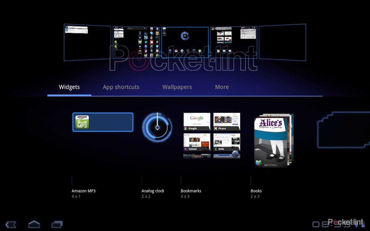
Homepages can be rearranged via the same method: a long press picks up an icon, shortcut or widget so you can move it around, move it to another page or remove it. However, there is an over-arching customisation section for the homepages accessed by tapping the plus icon in the top right-hand corner, or via a long press on the wallpaper.
This takes you through to an overview where your homepages are displayed across the top of the screen and the bottom section is divided into tabs offering Widgets, App shortcuts, Wallpapers and More (which offers the usual selection of bookmarks, contacts, directions, Gmail labels, etc, as you’ll find in Gingerbread). From each of these tabs you can then drag and drop what you want to the page you want it on, making customisation really easy.
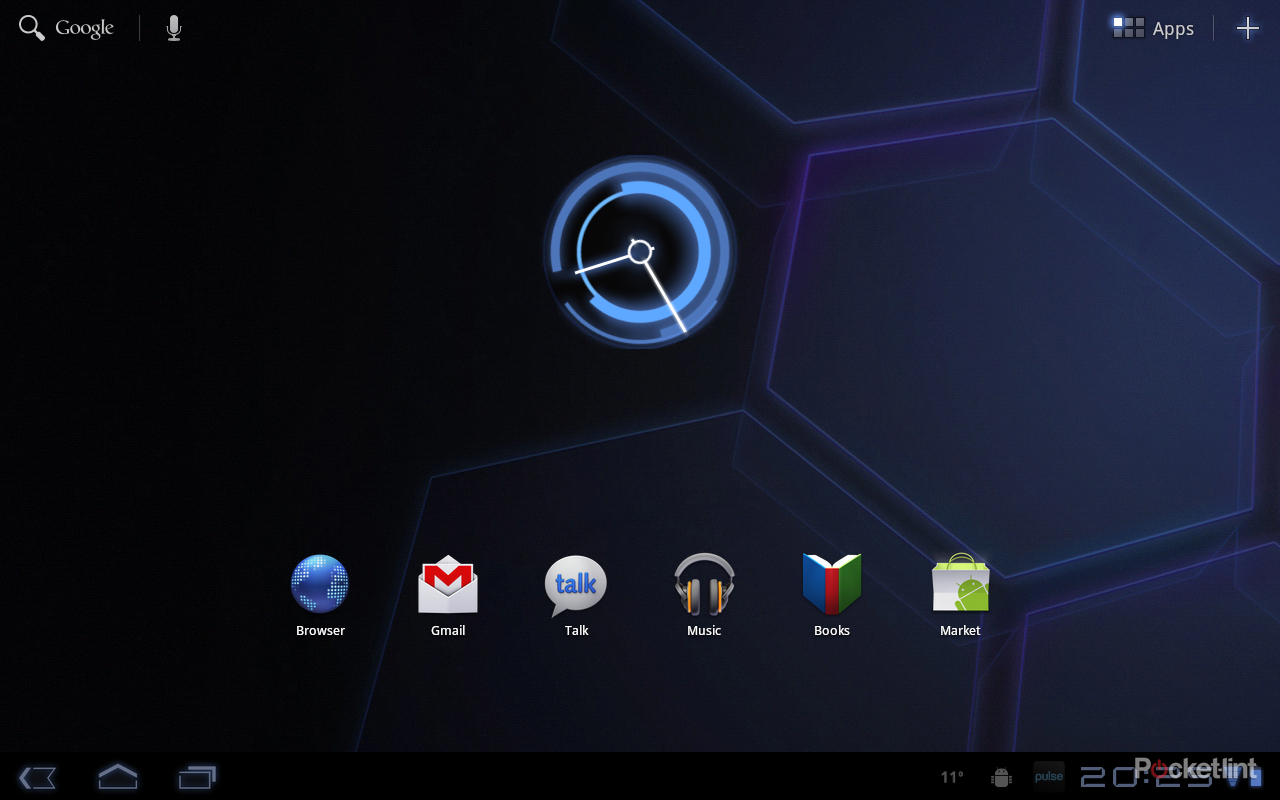
There is a strong “Tron” look and feel to Honeycomb and the default arrangement is dark and sophisticated: it looks and feels technical, it brings with it a sense of geeky excitement. The selection of fonts, the angular blue-grey neon-esque styling is a great juxtaposition to Apple’s simplistic iOS appearance on the iPad.
Homepage features, basic controls
The Honeycomb homepage actually offers up a great deal of functionality - it isn’t just a collection of your apps. The top left-hand corner offers a Google search area, comprising both text and Voice Search. The text search is a straight Google search returning the results you’d expect. If you’ve not experienced Voice Search before it is worth playing around with.
Essentially Voice Search is a connected service, so the host device doesn’t do the analysis, rather it happens in the cloud and returns the relevant results. It’s a powerful tool and we’ve found that it makes a little more sense on a tablet than it sometimes does on a phone because of the way you use it (walking with a phone, sitting with a tablet): it feels right on Honeycomb. Voice Search can do smart things like find you directions to a local restaurant on Google Maps, offer up search results or find and play music online.
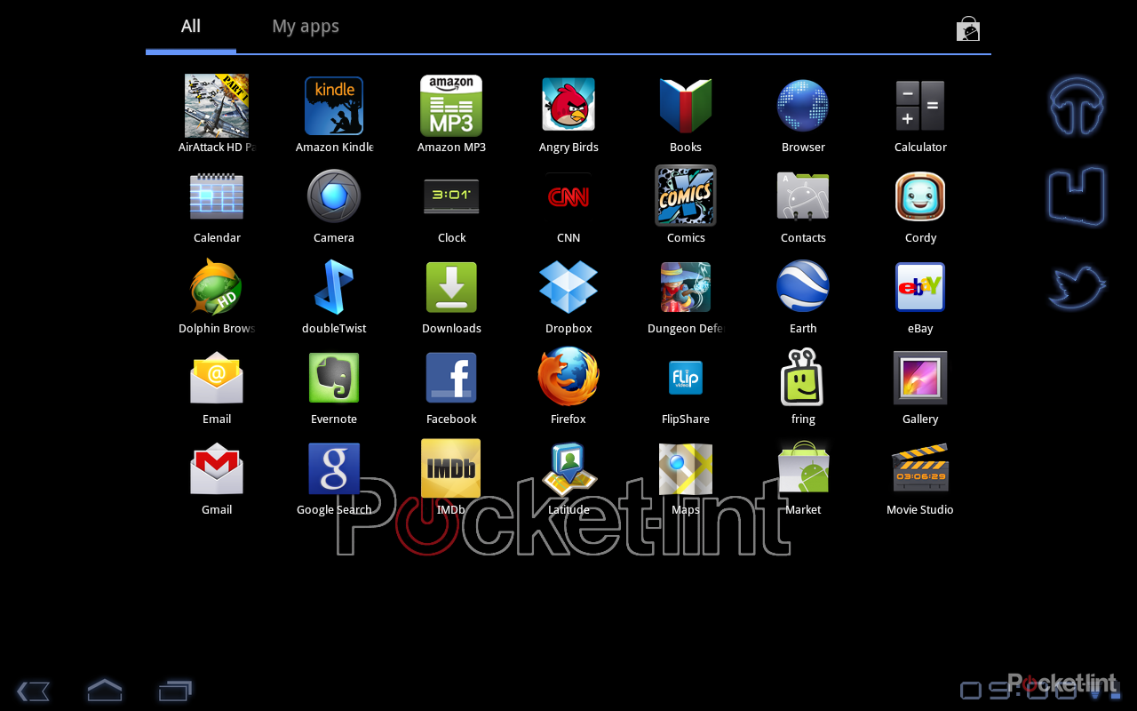
Move over to the top right-hand corner and it’s here that you’ll find the apps menu and the customise “plus” icon we’ve already mentioned. The apps menu simply opens up the full-page menu which scrolls left to right. Again, you can see you have something over the page by an outline of the app icon, which is pretty smart.
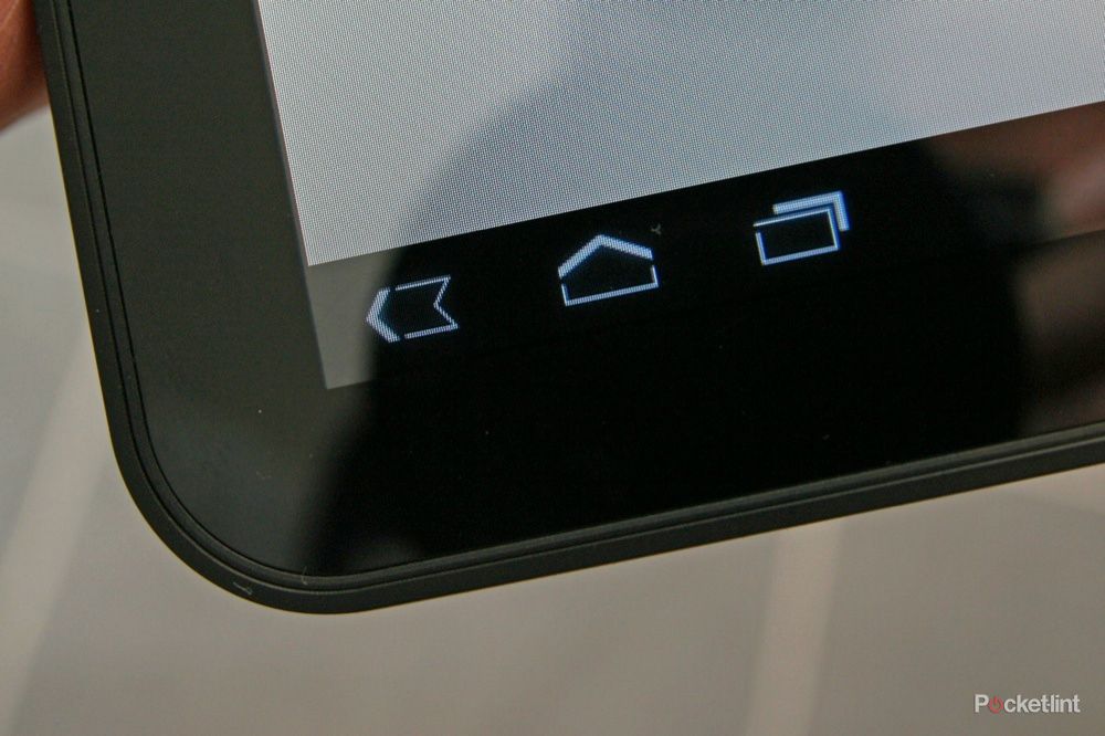
The bottom System Bar on Honeycomb swings in and offers some of the (usually) persistent top notification bar you’ll be familiar with in Android on your mobile phone. On the left-hand side it offers three major navigation icons: back, home and recent apps, which pops-up so you can easily switch to something else. These three icons exist in most Honeycomb windows and are always in the same place so you pretty much know what you are doing all the time.
The control icons in the bottom left-hand corner will change - for example when you tap the recent apps icon, the back button turns into a down arrow to close that menu. You’ll also get a menu icon appear in relevant apps, which opens the regular app menu for your Android application. It’s here that things are a little inconsistent as native apps (Chrome browser, Gmail, Google Talk, Music, Books, Android Market, YouTube, Calendar, Contacts, Google Maps, Movie Studio), which have all been written for Honeycomb, feature a menu button in the top right-hand corner when open on the Action Bar. As a result, existing apps and new native apps are controlled slightly differently. It isn’t a huge deal once you know about it, but it would be nice to see a degree of uniformity for something as simple as menus.
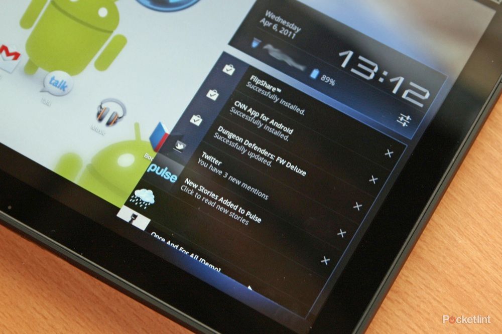
The bottom right-hand corner of the System Bar is all about information. It is here you’ll find the time, the connection status, battery life and notifications. Honeycomb is lightyears ahead of iOS when it comes to notifications. Notifications will appear as icons in the bottom right-hand corner, so will inform you of emails, tweets, app updates and so on. These can be tapped to pop them up and deleted individually, or again tapped on to open up the relevant app.
It’s a sensible approach to notifications, meaning you can be getting on with whatever it is you do and deal with those over events as and when you like - be that an IM chat over Skype, checking your new emails or a reminder from your calendar. It is similar to the existing Android notification system, but given the extra space, there is more information which is exactly what you want from a tablet.
Tap the clock and it will open up all the info from that bottom corner, also detailing which Wi-Fi network you are connected to and giving a shortcut to your settings menu, which is usefully placed. Other apps will also tap into this area as they do on your Android mobile phone and we found that Skype and Weatherbug both happily slotted in so we had easy access to those background apps.
Now we’ll move on to some of the big-hitting applications that offer up the core functionality of Honeycomb.
Browser
The way we see it, the browser is a massive part of any tablet. It’s your major gateway to the Internet. With an expanding range of online services, the browser can also swing into action to serve up these services where dedicated apps don’t exist. The iPad might have a huge range of apps that Android currently doesn’t, but to a certain extent you can use the browser in place of those apps perfectly well.
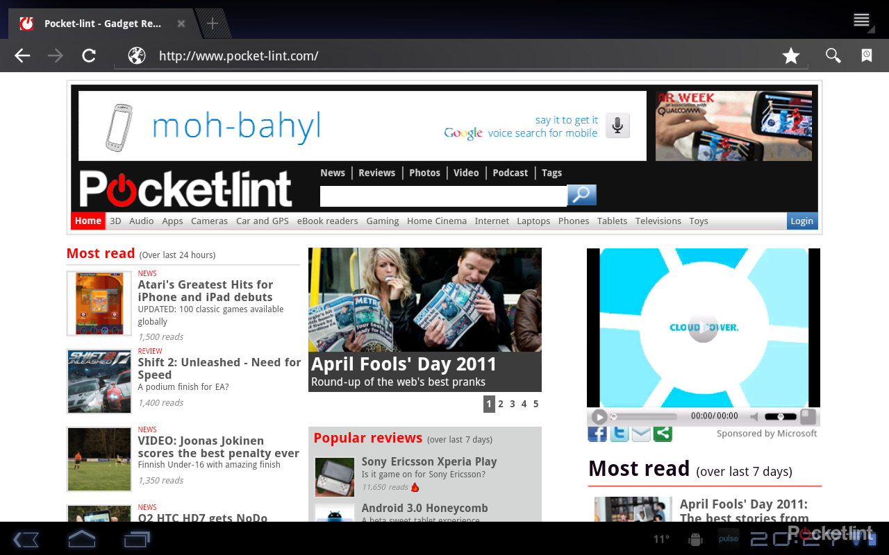
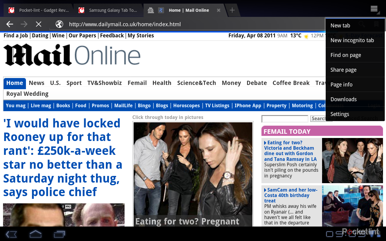
The Honeycomb browser is well designed. It packs in a lot of functionality familiar to those who’ve used Google’s Chrome browser, with a little twist for especially for the space conscious tablet user. First and foremost, it will offer up a regular browser window very much like chrome in appearance, with tabs across the top of the page so you can very easily switch between different browser windows. Beneath this is a very standard set of controls (back, forward, refresh) and your address bar, which also doubles as search. You get the option for Voice Search again and finally you have a bookmarks icon.
Like Chrome for your PC, you can opt to have the start page of the browser open on your most visited websites and you have the option to open an Incognito window which will let you research nefarious content without that activity finding it’s way into your most visited sites or search history.
It is incredibly fast to load pages and because this is Android, it will also offer up Flash content once you’ve downloaded the update from the Android Market. At the time of writing Flash Player 10.2 is classed as a beta build for Android 3.0.1, and we found it to be mostly stable, but not entirely adept at controlling the Flash content it was dealing with.
For example, we went to the Channel 4 catch-up TV website 4OD and found navigation was tricky at best, thanks to the diverse nature of the site with multiple Flash components. Fortunately, this being Android, there is an alternative approach, and we found the Dolphin Browser HD handled the website much better because you could leave the Flash out of the equation until you arrive at the point you actually need it, i.e., playing the video you’ve selected.
Flash is some of a, um, flashpoint in the battle between different platforms, but it exists and Honeycomb does let you consume that content. It isn’t as seamless and straightforward as it is on the full browser, and hopefully through some clever development it one day will be - but we’re not there yet. At least you can access that content so you have a more inclusive experience than you might find elsewhere.
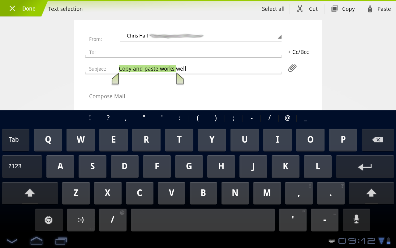
Pinch zooming is present as well as double-tap resizing and text reflowing if you magnify it larger than the screen space available. You can easily search a page or share it, and if you want to copy details from a page, a long press will bring up your highlight tabs so you can copy and paste, or share directly from the usual sharing options. The same option exists fairly universally in core Honeycomb apps, so select the URL and you can copy it or share it, open a Gmail message and you can do the same, but head into IMDb for example and you can’t.
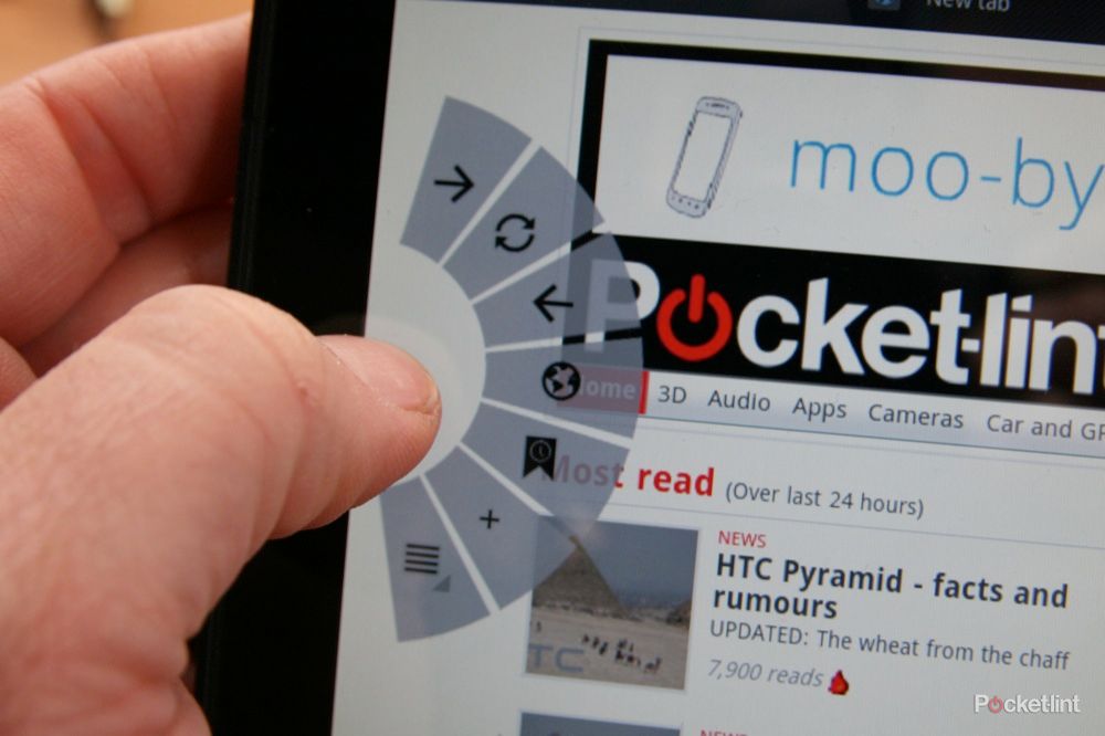
Lurking in the settings menu there is an option for Quick Controls. It currently sits in the “Labs” section, so we can take it as an experimental feature. This essentially does away with the traditional navigation controls at the top of the browser and replaces them with controls that appear when you touch at either the left or right edge of the screen. This then opens a splayed control, ideal for quick navigation with your thumb or finger. It means you can have fullscreen browsing and then instantly get to your basic controls, open a bookmark or pop-up the keyboard to type in a new URL. It’s pretty clever and again takes into account how you hold and use a tablet device.
The Work: Gmail, Contacts, Calendar
Sign into your Honeycomb device by adding you Google account(s) and you’ll find that everything starts falling into place within seconds. For an Android user this is one of the defining moments. As long as your Google accounts are in good order, you’ll find that your army of contacts marches into your tablet and sets up camp. Your calendar is live, and your email, with labels, it ready to roll. This is also the huge gulf between “real” Android tablets and those squatting on the open source platform, which currently don't offer this link to Google services. It is also the hardest part for Apple users to swallow: whilst the average iPad owner is plugging in cables and laboriously syncing with iTunes, your average Honeycomb user will have moved on to something else.
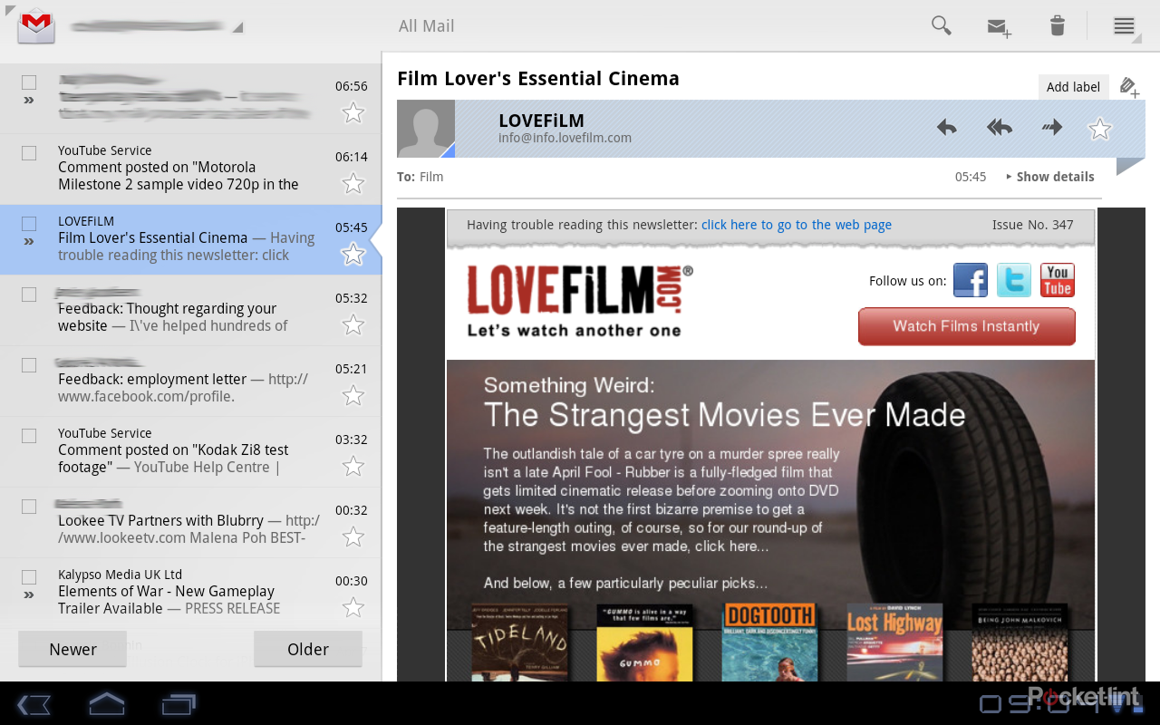
We’ve been using two Google accounts in our Honeycomb testing which is useful for seeing how Gmail can deal with multiple email accounts. Open up the Gmail app and you’ll find the sort of email display you expect on a tablet. It isn’t the mobile app four times bigger, no, it adopts a more logical column system. Essentially you get a listing on the left expanding into a more detailed pane on the right. At top level this presents your labels/folders, then threaded emails, so an entire conversation can be accessed from one place. Click through to an email and the display shifts left, so you then get a reading pane for your selected email. At all times your accounts can be switched via a drop down at the top left of the app.
This arrangement means you can, for example, sit in your inbox and move down the scrollable list of emails on the left. The individual email reading panes contain all the information you need to properly digest them. The header information draws out contact information, including pictures, so you can click on someone’s face and contact them via whatever connected means you have - Gmail, Twitter, Skype, for example.
From an email you can view or save attachments (as long as you have support - we couldn’t do anything with ZIP files) and then of course take all the actions you’d expect - reply, forward, mark as favourite, delete, add label and so on. You can also search, which offers up two types of return results: the first is an instant suggestion of contacts so you can then select to search by that person, or the second, when you hit return, is a straight search by the original word you entered. It makes for a great way to find emails in a hurry.
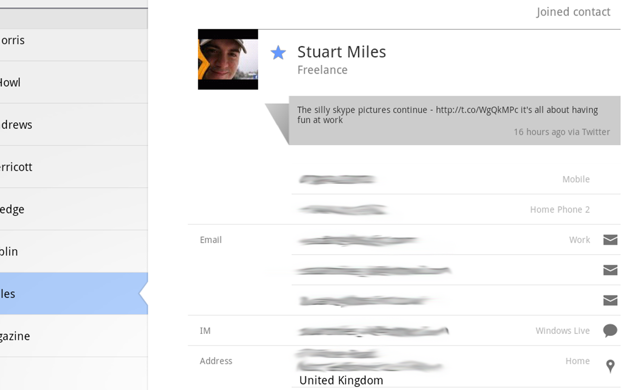
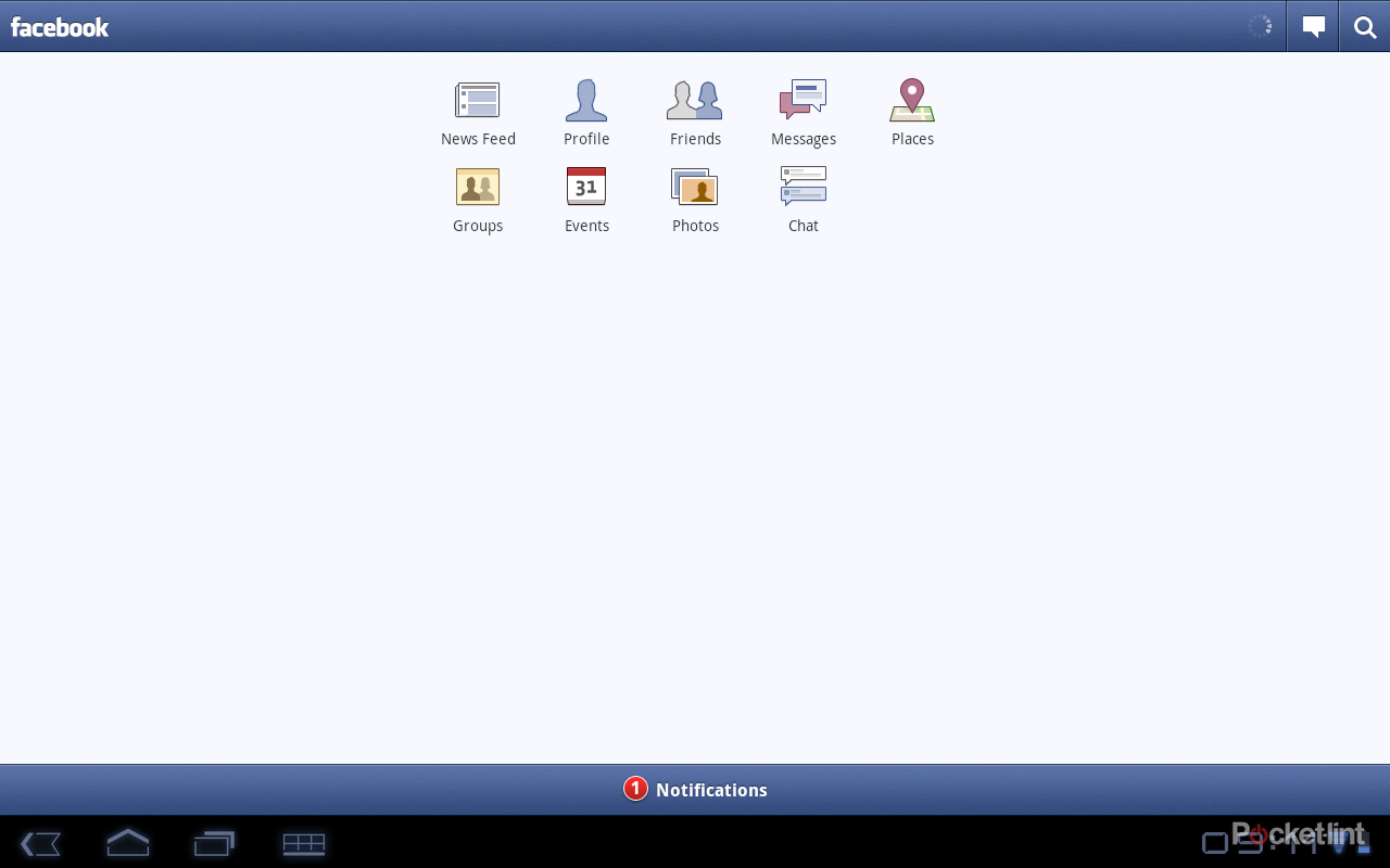
Contacts listing themselves get all the integrated treatment that you expect from Android. That means that you can have Twitter and Skype accounts listed along with whatever is pulled over from your Google Contacts listing. Again Contacts are arranged in a column system so it’s really easy to get around and see all the information. From a contact card you can send email, view addresses, and roll over to connected accounts like Twitter or Skype. Note there is no integration of Facebook information, the option to integrate contacts was missing from the Facebook app we installed, so it looks as though it has had the same treatment as the Google Nexus S.
A drop-down list lets you change the contacts you are viewing from the default “all” to categories in each of the different accounts you have synced. You can also drill down further to define which categories of people are displayed from each different account, so it is a fairly comprehensive offering.
The calendar is nicely arranged, offering up day, week and month views. A nice touch is that in day and week views you get a month overview on the right-hand side, so you can always glance that to check what day falls where. This right-hand column also serves up your calendar accounts, and tapping on them turns their display on or off, so you can cut out the clutter of your corporate calendar, for example. There is also a shortcut for “today” to get right back to the present whenever you need it.
Again, you get full calendar searching, with the option of turning off calendars in the settings, so if you have custom calendars - for example your marathon training program - you probably don’t want to bother syncing that when you don’t need it. You can sync Google or “corporate” accounts, the latter option taking you through to your Exchange account login.
Calendar reminders and new emails can arrive as notifications in the bottom right-hand of the screen (unless you decide to disable them of course), so you can jump right too them. All in all, Gmail, Contacts and Calendars work extremely well and for those of us who have busy lives linked into these Google services, this is exactly the sort of implementation you'd want from an Android tablet and we’ve no complaints in this department.
The Play: YouTube, Music, Gallery, Movie Studio
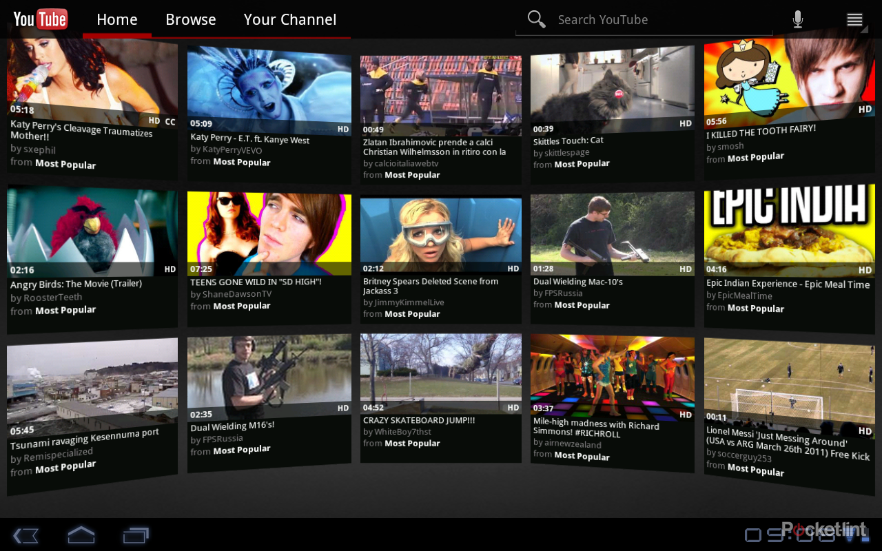
We’ve already mentioned video to a certain extent in dealing with Flash in the browser. YouTube is another Google offering and on Honeycomb you get a great app to serve up and increasingly impressive range of content. The YouTube app got extensive preview time before Honeycomb launched, thanks to that “video wall” effect. Because YouTube is linked to your account, if you have subscriptions these will populate the wall, along with other Most Popular suggestions - usually something to do with Justin Bieber’s hair, Katy Perry’s cleavage or the works of Ray William Johnson.
You can of course browse via the normal channels and “top” selections, or search directly. Punch up a video you like the look of and it launches, offering up information, related videos and comments on one page. Clicking the playing video lets you go full screen or switch between HQ or lower quality. In fairness at full screen is doesn’t look fantastic, it’s a little low resolution even in HQ, so you might decide to watch it in the smaller window anyway. Videos can be easily shared too, including uploading videos to YouTube from the Gallery video player.
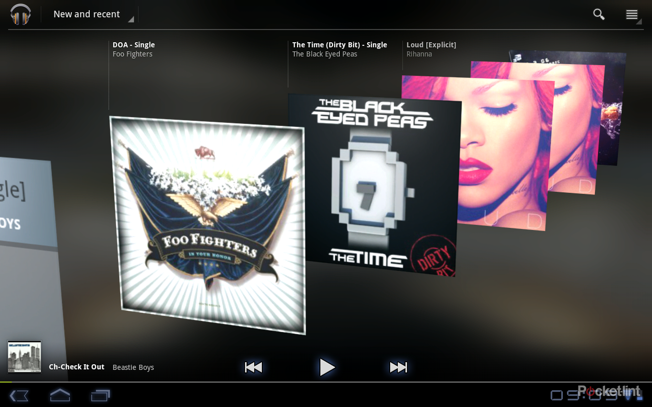
The default music player adds some interested elements. The “new and recent” view offers up a scrolling 3D effect so you can scroll through your music collection and really take advantage of your album art. It looks really cool. Again, the controls are pretty much the same as other native Honeycomb apps, so a left-hand drop down menu offers up a different view selection so you can switch to song, album, artist and so on. A now playing bar across the bottom means you can browse and still keep control of your music. Also, a headphones icon appears in the notification area at the bottom of the screen so you can instantly get to you music, pause, skip track or end play completely.
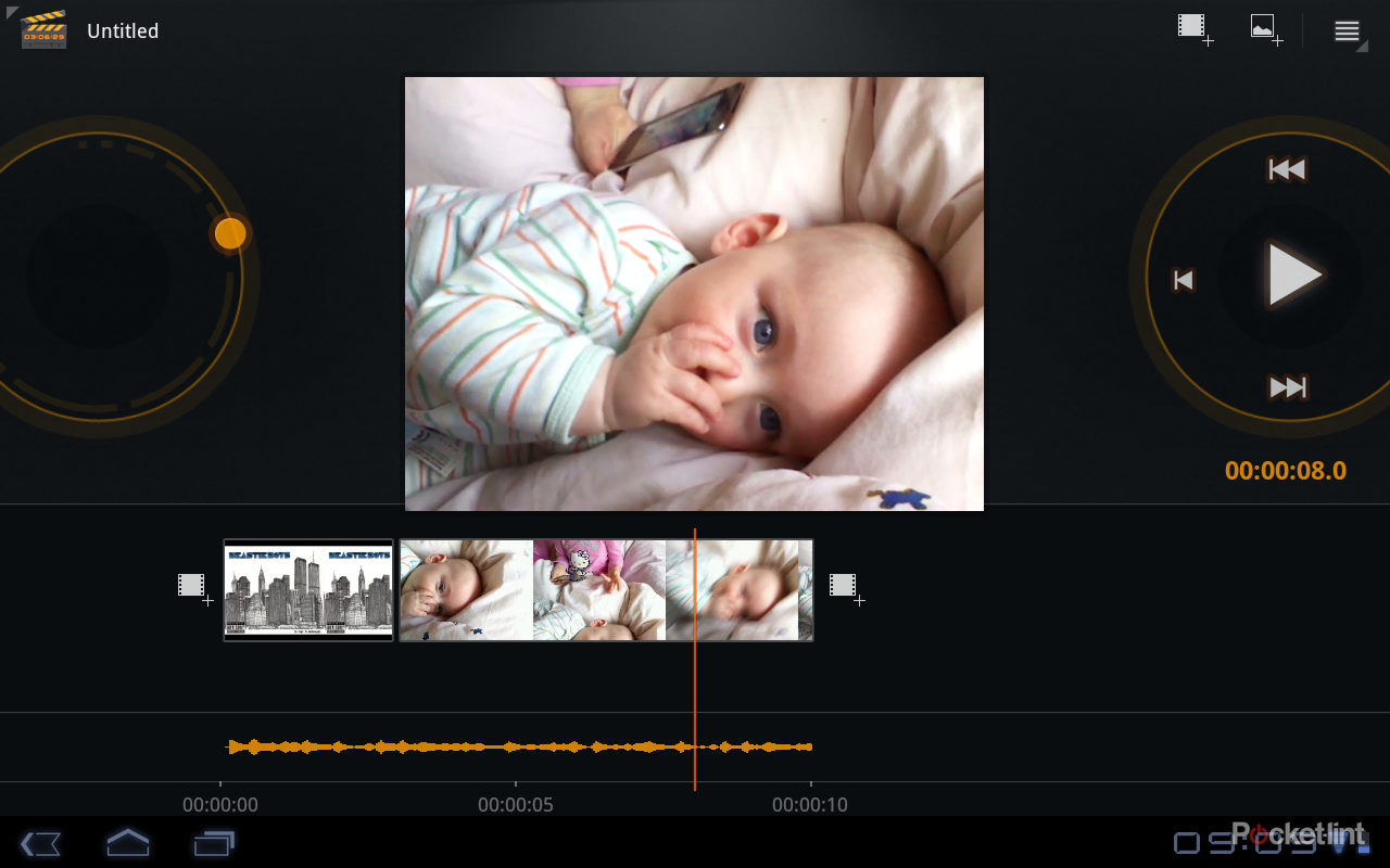
The Gallery offers up your photos and videos in pretty much the same style as mobile phone users get, so there is no great change here, although you get easy access to things like sharing and editing up in the top right-hand corner when browsing images. Movie Studio is Google’s lightweight stab at movie editing on tablets. It’s nice to have something to chop film clips together and it’s pretty simple to drop in photos and video clips, and add in a music soundtrack, but it is very basic.
Android Market
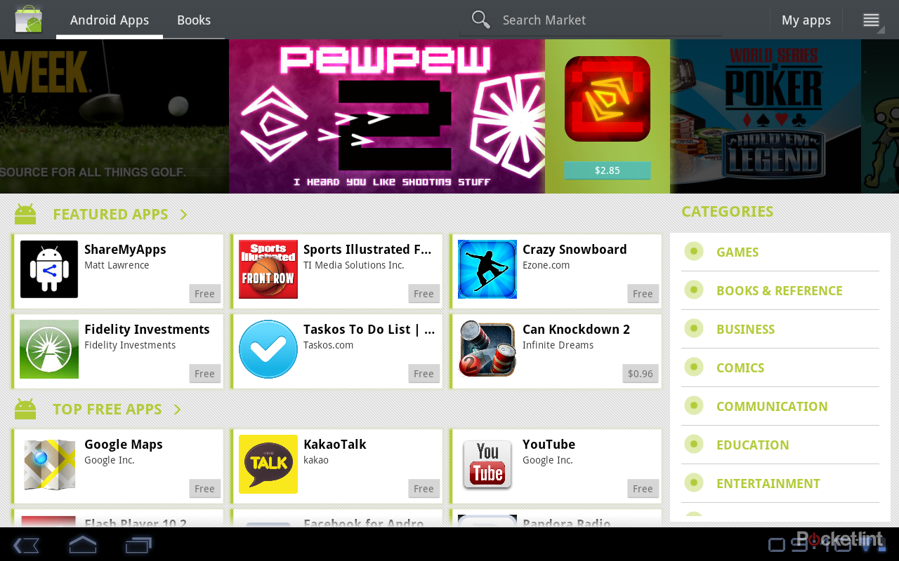
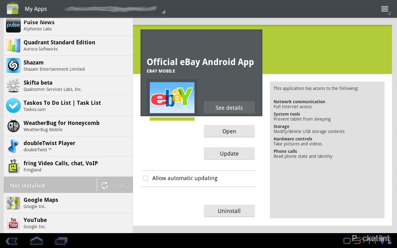
Android Market has been redesigned for Honeycomb and visually we’re not sold on the new look and feel. Some strange decisions seem to have been made around the Android Market which makes it feel a little unwieldy. One of the strange things is an arrangement whereby you can have different applications associated with different accounts. As we signed in with two accounts, we had the option of shifting between these two accounts in Android Market. This isn’t something you normally see in an Android mobile phone, but you can sign in to different accounts (if you use more than one) on the Android Market website, and see what apps have been linked to what account, so it's obviously something that does happen on your mobile phone too.
On the device it can be a little confusing, because if you’ve been installing on say Account A and you flip over to Account B, you’ll look to see what is installed in My Apps and find a barren list. You might also be told that core apps aren’t installed (like YouTube, Google Maps and Adobe Flash Player), even though they are on the device under your other account.
Yes, you might have Google accounts that you want to remain separate, so all the fart buttons are on the private account and the sensible business apps are on your work account, but when put into a single device there needs to be a better way of viewing or managing them. Management isn’t great as it is, as you’ll be taken to My Apps when you go to install a new app and whatever app you were viewing last in the list will still be displayed as your new app downloads. We had a double-take a couple of times because we thought we were downloading Angry Birds again. These are minor issues, aside from confusion, because they don’t actually effect the running of the device. But there is, at the time of writing, a larger problem in the app space.
The apps designed to run on Honeycomb are few and far between. Yes, we understand that Android is much better at scaling apps than iOS is, but Steve Jobs did have a point when he mocked Android’s paltry tablet app offering (even if he failed to mention that Honeycomb hadn’t even launched at that point). Given the space on offer, it’s down to developers to come up with something a little more engaging. In many cases a scaled app leaves you with a lot of empty space.
But it’s not all bad. Fire up Angry Birds or the Amazon Kindle app and you’ll have no problems. Graphically, most apps look fine, but some don’t get on with larger Honeycomb devices. With a lack of video streaming functionality, we installed Skifta. Although the app runs fine and the video plays without issue, the loading screen finds itself distorted and stretched across the page.
These are early days for Honeycomb (at the time of writing) and with only one device currently available, we can understand that developers haven’t raced off to upgrade their apps. It will be easier to judge exactly how the app space is going to evolve in a few months when there are more Honeycomb tablets at a wider range of price points, but as it stands at the moment, it is something of a negative point for early adopters.
Keyboard
The keyboard is your main point of interaction for many features. If you’re not going to get down and dirty with Voice Search, then the keyboard will be something you use frequently. The Hoenycomb keyboard has the size and space to let you enter text accurately. The experience may differ from device to device and size will dictate whether you can use two thumbs from the sides, or if you can use it more like a regular keyboard with multiple fingers.
We found that at 10.1-inches, there was enough space to enter text with some speed. The keys mostly only offer up one character, but you’ll find that some of the punctuation keys offer a second character on a long press. There is no long press for caps on the regular character keys, so you’ll have to use with the left or right shifts to make that happen. The arrangement is convenient enough except for one thing: the down arrow in the bottom left-hand corner. We found this fell under the hand when typing and we closed the keyboard too many times to mention. When being instructed to play the piano, Mother used to place a coin on the back of ones hand to make sure the hands stayed up and the fingers could dnace across the keys. Effectively you have to do the same thing with the Honeycomb keyboard, or it will close down when you swipe the button with your left palm.
The keyboard offers corrective predictions across the top as you enter and after some practise (and balancing a couple of coins on the hands) we found it would let us enter text fairly rapidly, typing as we would on a regular keyboard. The accompanying drumming noise as the fingers tap the screen is just a bonus.
A few other details
Other Google apps that you get include Google Maps, Google Books and Google Talk. Google Maps offers the same experience as Google’s excellent service on your mobile device, but the huge screen is great for searching things out and getting the lay of the land. Honeycomb tablets are likely to be too big to whip out in the street to get directions, but sitting in your local coffee shop it’s a great experience.
Google Talk lets you chat and call through your device. If you have the hardware in place it will also let you video call other Google Talk users, although it has to be said, the experience isn’t as refined as FaceTime is.
Getting content onto your Honeycomb device is also a little different from Gingerbread. In the past the easy method was to mount the memory so you could interact with the drive directly. In Honeycomb there is protocol support for direct syncing with things like cameras and PCs - without the need to mount the hard drive first. What this means is that you'll be able to interact with the memory on the device whilst it is syncing - so if you are moving music to the device, for example, you can start playing as soon as the file has arrived, rather than having to give the memory back to device OS before it can access it. This potentially means you'll be able to set up a Honeycomb tablet as a live monitor, for example to shoot images on a connected camera and view them on the device for editing and sharing all at the same time.
To recap
A host of promising and exciting tablet features that deliver a mature and sophisticated user experience. Unfortunately it just isn't ready for public consumption yet

