In the last 10 years, the way people access and consume the internet has changed drastically. No wait, in the last 3 years the way people access and consume the internet has changed drastically. Scratch that, in the last 6 months, the way people access and consume the internet has changed drastically.
The world is changing, and changing fast.
When I started Pocket-lint in 2003 people were still getting excited about ASDL in the home, 3G was about making video calls rather than surfing the web, and the concept of apps, tablets, and smartphones that we can't prise ourselves away from was still a twinkle in many a product engineer's eye.
Today in 2013, the world is very different. We live in a Post-PC era where websites are read on the move, on the train, even on the toilet. They aren't just restricted to a desktop PC at work.
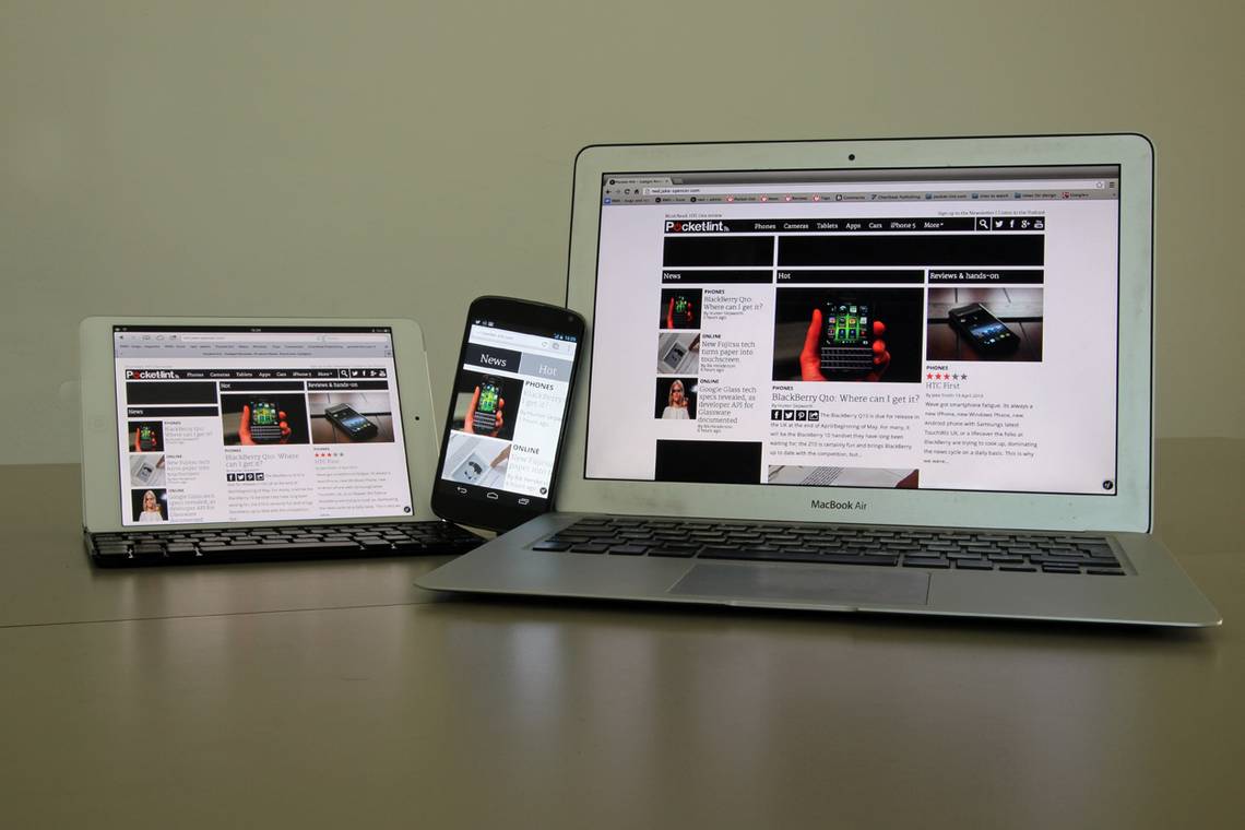
It's not just about accessing sites on the phone either, but a range of devices that come in all shapes and sizes and used in a number of different environments.
Welcome to the new look Pocket-lint.
The idea is simple. We've taken all that you know and love about the site and simplified it even further, making it super easy to use, no matter what device you are on.
Use a huge monitor with a high resolution? No problem. Use a standard laptop? No problem. How about a tablet on the sofa? We've got you covered. And yes smartphone users, we've got a design for you too.
Designed and coded from the ground up with a "mobile first" approach, the site works on any device, adpating itself to create the best experience for the screen size you are on without losing anything in the process.
So what's new?
In the process of embracing a new design we've made some changes that will make your visit more informative and more enjoyable than ever before.
News / Hot / reviews
The biggest change is that we are introducing a new News / Hot / Reviews column on the left-hand side of the page in the desktop mode that gives you instant access to the latest news stories, the latest reviews, and what is hot on the site right now.
For phone and tablet users we've hidden this new column as we understand that you want to view the content without distractions. To access it, just press the new menu icon (three bars) on the masthead on a tablet or phone and you can see all the latest stories.
Author access and sharing
Our new author panel at the top of every story lets you connect with our writers on Twitter, and adds greater support for the multitude of social networks that are available today.
Big pictures
We love taking great pictures, and we know you love looking at them, so we've created a new photo gallery feature that lets you enjoy our photos even more. If you want to launch the gallery in full screen, you can. If you want it to play a slideshow for you, you can.
On the tablet and mobile experience you can also use your finger to swipe through the images. Our new gallery lets you jump between photos and pictures quickly without having to keep on clicking next, and lets you sit back and watch a slideshow if that's what you would prefer to do.
Improved homepage and hub pages
The new-look homepage lets you quickly see the latest news stories we are publishing, the latest reviews and hands-on, and what's hot - those must read stories.
Hub pages on Pocket-lint also get an overhaul, giving you the latest for a particular subject and letting you search our extensive review database. We've got thousands of hub pages all accessible via a URL and they range from our super hubs like Phones, Cameras, Gaming, and Cars to smaller subjects like Compact cameras, company pages like Google or Apple. We even have specific product pages like the Samsung Galaxy S4 or Xbox 720.
Speed
You should have noticed it already, but one of the core things we've concentrated on in the new design is making sure the site loads as quickly as it can. We have re-written every piece of code so that Pocket-lint is now a fresh new site that is blisteringly fast.
More to come
It's a famous phrase that is used by all websites when they redesign: there is more to come. But here we really mean it; what we've created so far is a brilliant new platform on which to build, and that's very much what we plan to do. We will be introducing more over the coming days, weeks, and months.
With that in mind, if you've got a feature that you would love us to add or want to see please let us know via the comments below, the feedback form, or via Twitter and we will see what we can do.
Likewise, if you see anything funny going on that doesn't work in the way you expected, please let us know.
In the meantime enjoy the site,
Stuart and the Pocket-lint team.