HTC's Sense user interface has always been one of the more beautiful overlays available on Android phones, and now it seems that the company is reducing the clutter and making them even more stylish.
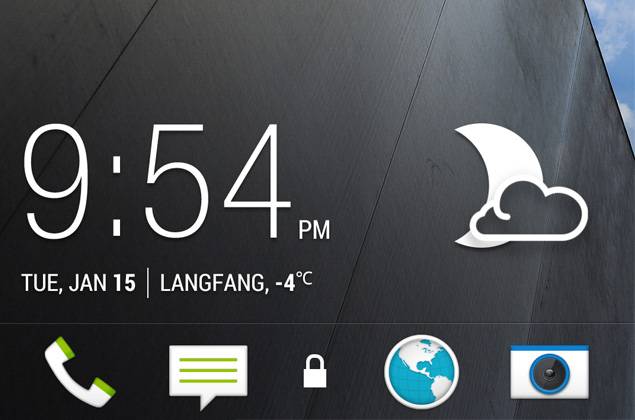
In the screenshots we've seen from XDA Developers and Android Police there's significant tidying of the UI. The clock, for example, has done away with the now out-of-fashion skeuomorphism flip-over style, along with the unfathomable unlock ring, and replaced them with more elegant looking designs.
There also appears to be a lot more room on your home screen by default, leaving plenty of space for app icons, which are likely to be more popular than a hulking great clock and massive weather graphic. If you ask us, the fonts used and visual style have a lot in common with the rather wonderful LG Prada phone.


There also appears to be a page shown with customisable tiles. This does have a whiff of Windows Phone about it, but we're also quite excited by the idea of a screen where we can have access to feeds and news, all in one place. Sense has always been one of the better overlays for aggregating information from your various services, so it would be great to see a stylish theme that can bring everything together.
Most of the interface elements we've seen here look like a small change from Sense 4. The menus have the same HTC colouring as always and the notifications tray retains that dark grey and green look that HTC favours.
It all looks rather good to us, but only time will tell if these are real, or the work of a passionate HTC fan. It has to be said though, XDA Developers is a pretty reliable source for cutting-edge Android hackery, which gives us some hope.