Flickr has reinvented itself. Gone are the days of thumbnails and white backgrounds, replaced instead with full bleed, full-resolution photos and a whopping 1 terabyte of free storage.
It is the most drastic redesign the photo sharing site has ever seen and it has been long overdue since Yahoo bought the website in 2006. So what's new?
Storage
Flickr previously existed in two forms: Flickr Pro and the non-paying conventional Flickr. Those who stumped up the £15 a year for Flickr Pro benefited from unlimited photo uploads and the ability to view in-depth statistics for their Photostream.
This has now all changed. Everyone who signs up for Flickr will be given 1 terabyte of free storage as well as the ability to upload video up to 1GB in size.
Flickr Pro users will continue to have an unlimited photo storage cap however, so if you plan on storing more than the roughly 537,730 photos which equates to a terabyte, then you're in luck.
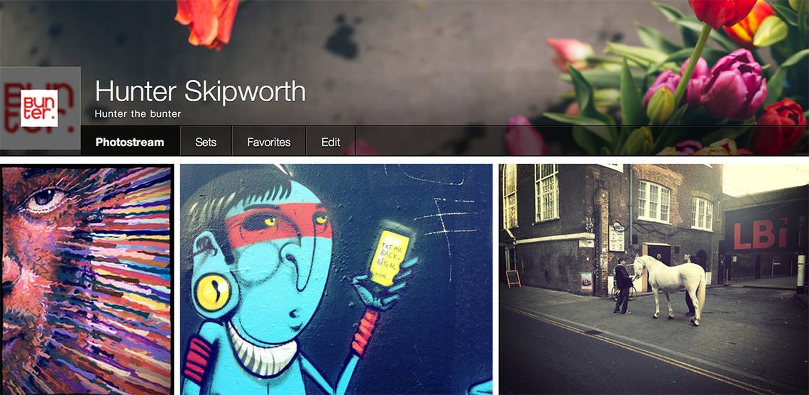
Photostream and profile pages
This is where the biggest change lies in the new-look Flickr. Previously visiting someone's profile would grant you a long scrolling list of their images, all in low-resolution thumbnail form.
Now when you visit someone's Photostream, images are grouped together in a long list of thumbnails, all of which are shown in high resolution. They look fantastic on a Retina MacBook Pro.

The Photostream has become more like a Facebook profile page, so there is an image banner at the top with a picture of the photographer to the left. The number of images is listed as well as in sets and you can quickly skip to other parts of a Flickr user's profile from the toolbar at the top.
Slideshow
One of our favourite new tweaks is the ability to jump rapidly into a slideshow from a person's Photostream. Situated on the top right of the page, next to the share icon, is a slideshow button.
Hit this and the images and website will immediately open up in full screen and begin flowing through with various transition effects. It is a great way to quickly show off your own images or enjoy viewing your contacts'. Pictures also tend to load very quickly despite being of such a high resolution.
Home page
The new-look Flickr home page is designed to show you all the information and imagery from both you and your Flickr contacts. Any likes, comments or newly uploaded images will all appear here and can be rapidly scrolled through.
On the right things like groups are displayed and at the bottom of the page there are even some friend suggestions in the form of "people you may know". Clearly Flickr is working hard to make itself more social and the new home page makes this very apparent.
Viewing photos
Obviously at its core Flickr is all about viewing images. Previously clicking a picture would open it up in a slightly higher resolution, with comments and information listed below and the picture set on a white background.
Now when you click on an image they immediately open up in high resolution set against a black background. It looks much better and helps to show off images properly. The high resolution side of things is slightly worrying however as it does make it easier for people to store and use your pictures without permission.

At the bottom of images is a quick selection of links such as favourite, comment or share as well as the ability to add pictures to groups and send them full size. But none of the icons distracts you from the photo viewing, which is very important.
It isn't until you scroll down that this changes. Below images is where all information is now stored. A profile picture, comments and all the EXIF data from a photo can be found directly below it. This we like, as no distracting text is there initially to divert you from the photograph itself.
Contacts, Communities and Explore
The groups and sharing side of things is managed very much the same way as before, it just looks different. Pictures can still be sent to groups for approval and you can still add and manage friends in the same way.
The difference is in how the pages themselves appear. The group pool of images now follows a similar style to profile pages in that it has lots of smaller thumbnails for you to scroll through and select.

We don't like that Flickr has kept the same white background, text-heavy look of the group pages because it breaks the overall design of the new website. It takes multiple clicks to get through to a group photo pool and when you're there, the left-hand side of the webpage is still jammed full of distracting text.
As for the Explore page, one of the most popular parts of Flickr, this now consists of larger thumbnails which you can scroll through, rather than the previous clunky slideshow of the Flickr.
Clicking the contacts tab at the top of the page will open up the same look as the Explore tab, the difference being that the images here are all from your contacts.
Uploads
For some, Flickr is little more than a means to create a web-based back-up of all their images. Thanks to the 1 terabyte of free space we imagine plenty more will be joining this club.
Previously uploads could be done directly from Lightroom or through the Flickr website via its rather unstable Java powered uploader. Now all you need to do is hit the Upload tab and then drag and drop photos or video straight on to the website. Very simple indeed.

Alternatively you can select an image via your computer's file browser, tag it and then send it straight to your Photostream. Of all the new elements on Flickr, the Uploads side of things really stands out.